Pro: identity for a collective force
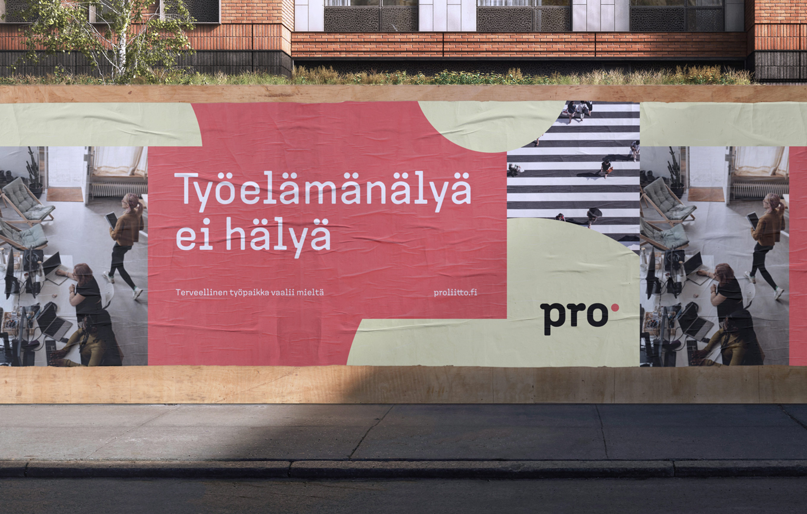
The brand renewal of the trade union Pro is a celebration of people power, strong community, and the importance of every single member. The new brand likes to chat, be sociable — speak human to human. The punchy red dot, soft color palette, friendly Pro Sans typography, and the heartfelt imagery embody Pro’s goal to safeguard the sweet spot of life, work, and joy. To build an equitable, just and humane world through collective power.
Pro