

Tirol: Alpine icon of past and future
Industry:
Challenge: Consistent on paper, scattered everywhere else
Tirol’s most recent brand work dated back to 2018 and, frankly, it showed. The guidelines were built print-first, for posters and brochures, while the rest of humanity had moved en masse onto screens, feeds and search bars. Nobody, from the regional team to the hundreds of local businesses carrying the Tirol name, had a shared idea for how the brand should look or sound once it left paper. As a result, consistency had quietly become optional.
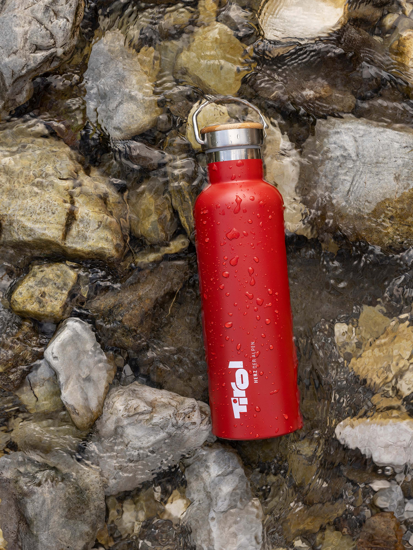
The gap was at its widest at Tirol Shop, the region’s retail arm and a place to embrace the brand. Without a clear read on who was buying and why, its shelves were filled with a scattered mix of products, some of it not living up to the name it carried in quality, idea or style.
Approach: A window with a fresh view
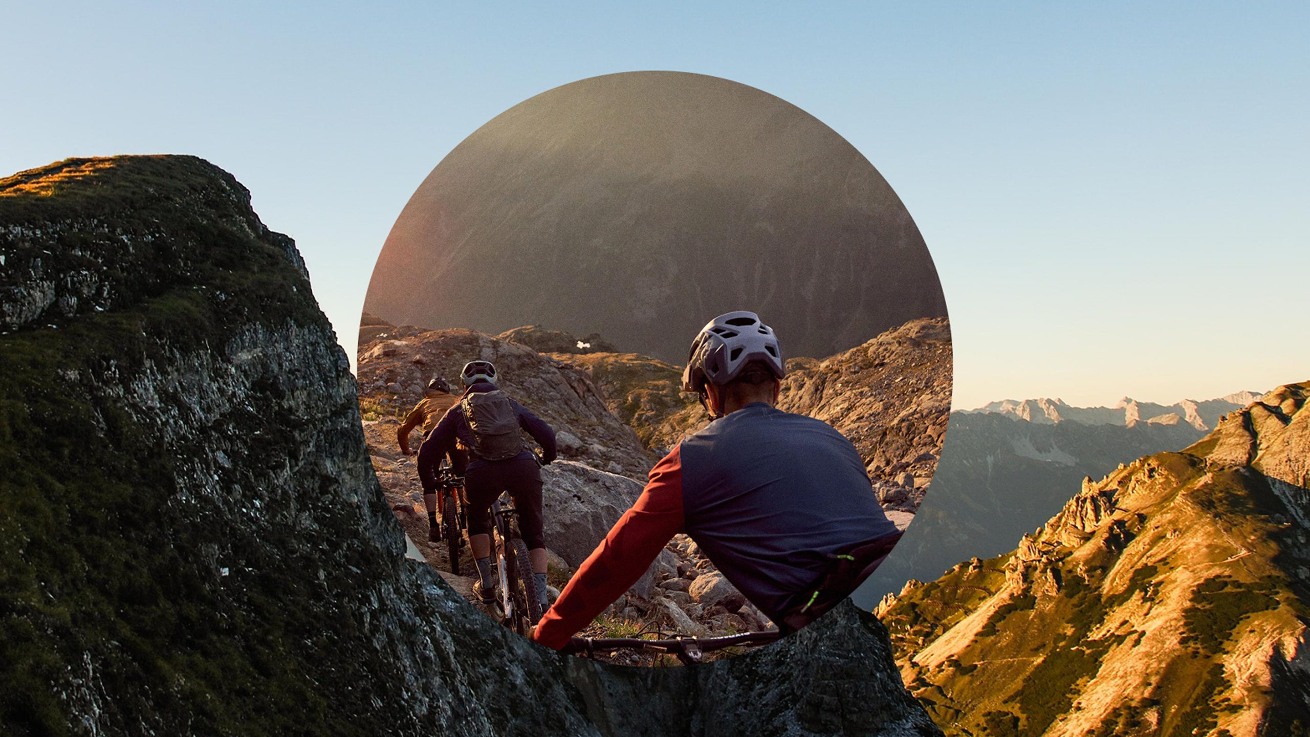
The work started where Tirol’s brand always should have: with the people carrying it daily. Together with Tirol’s own team and local entrepreneurs, we created “Window to Tirol”, a concept that now grounds every campaign, shop shelf and screen carrying the name.
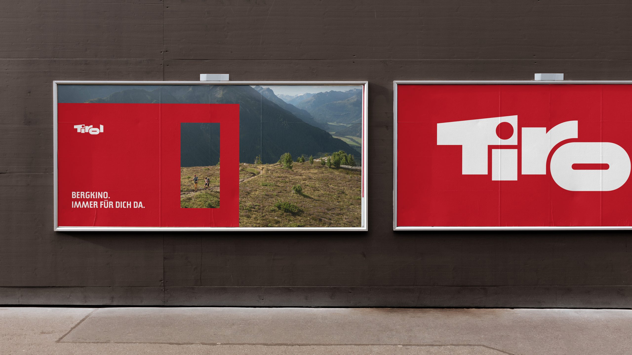
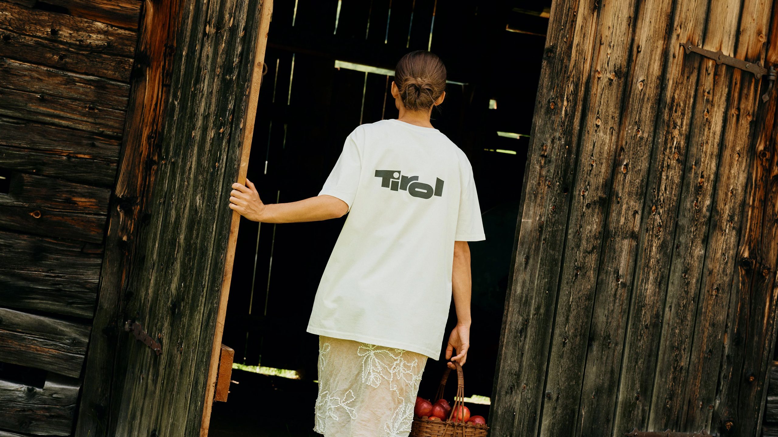
Some of the brief was already decided for us back in 1974. That’s when Innsbruck designer Arthur Zelger drew the Tirol logo for a newspaper advertisement, its lettering set against a suggested alpine skyline. Zelger’s own line on the design still holds: “Tirol kann man nicht exportieren. Man kann nur hinfahren” – “Tirol cannot be exported. You can only travel there.” He spent decades defending the mark’s independence, including arguing against a red box added around it in 1995. He vehemently believed a logo should lead its own life. That box loosened in a 2021 redesign, just before this project began, so we built the new system to work with Zelger’s mark rather than around a shape imposed on it.
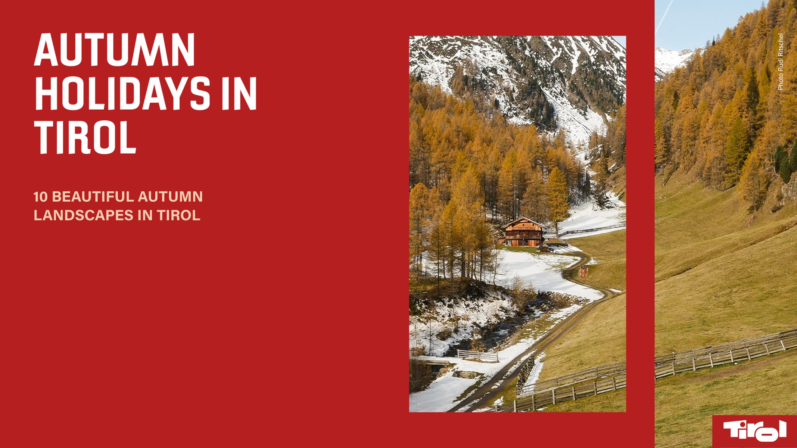
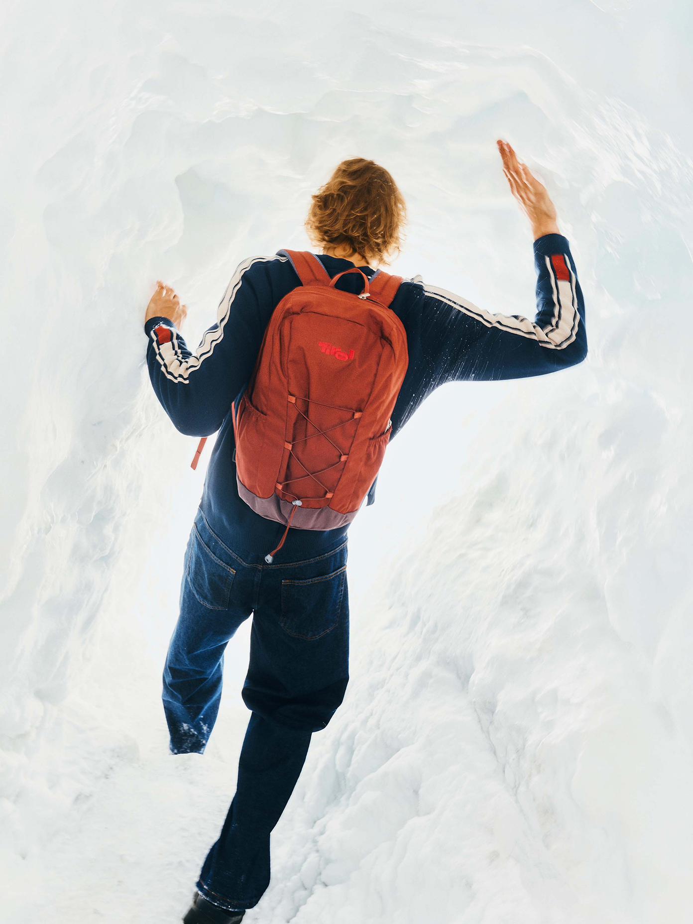
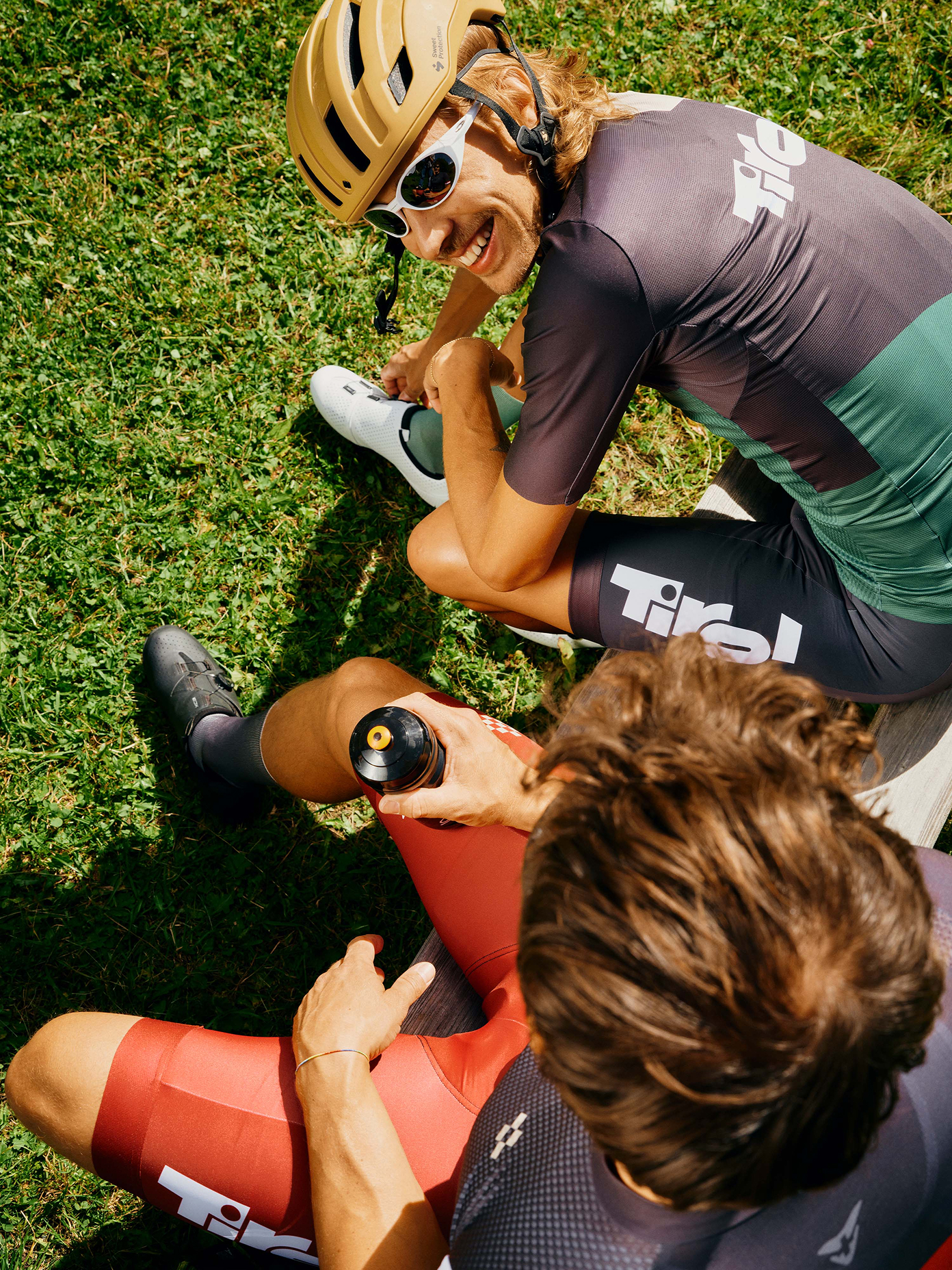
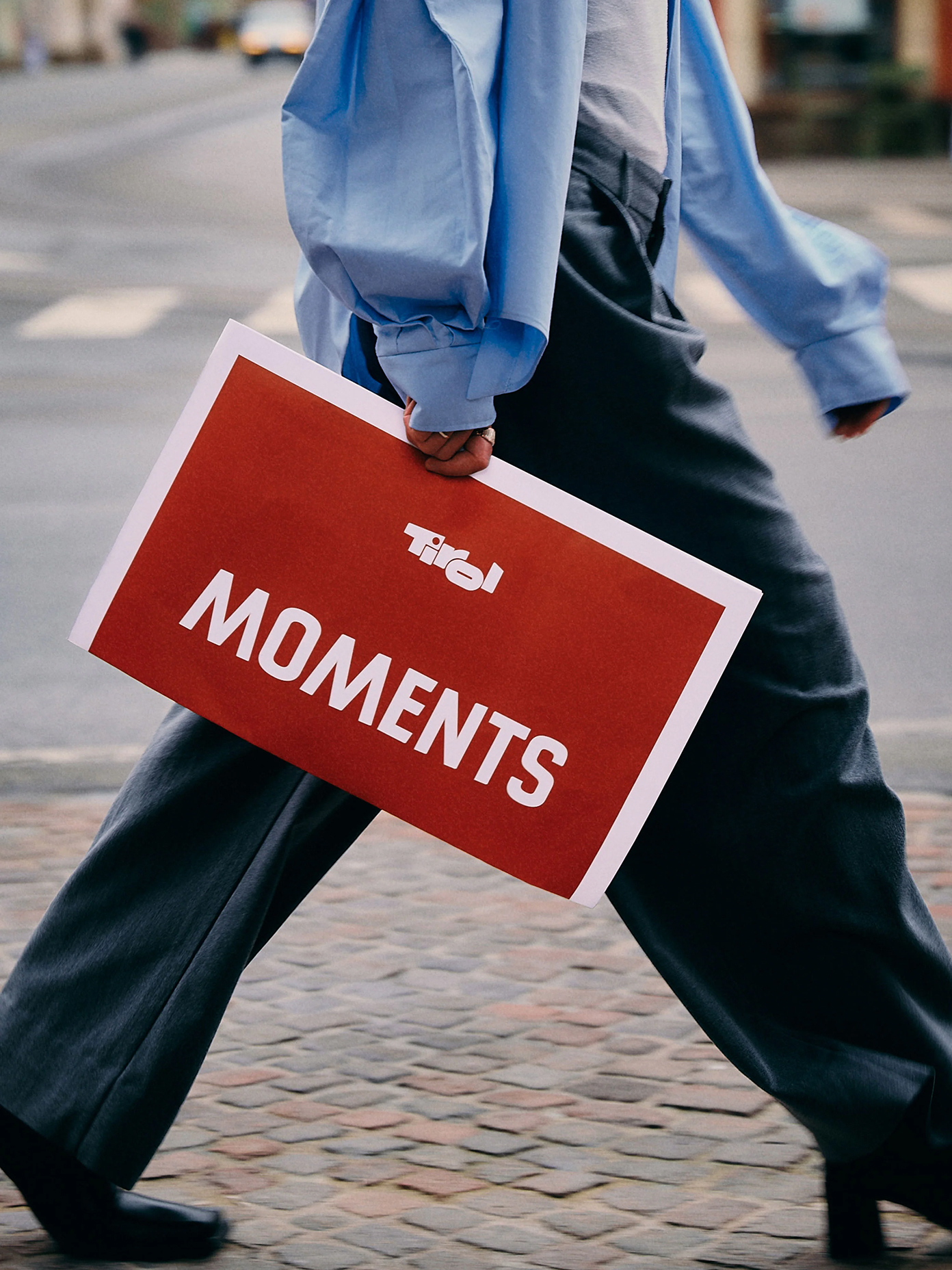
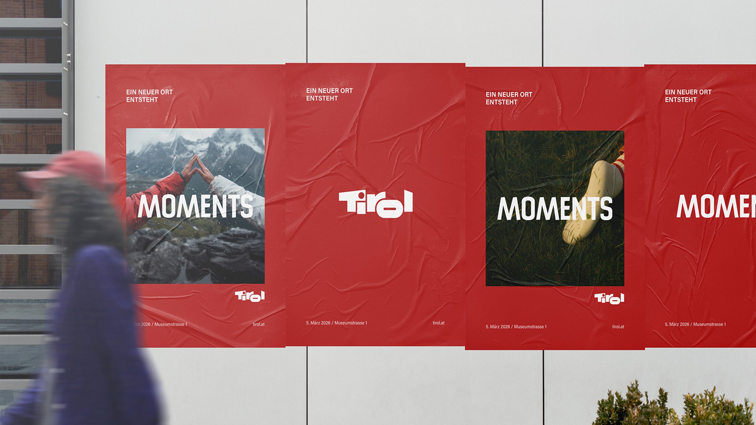
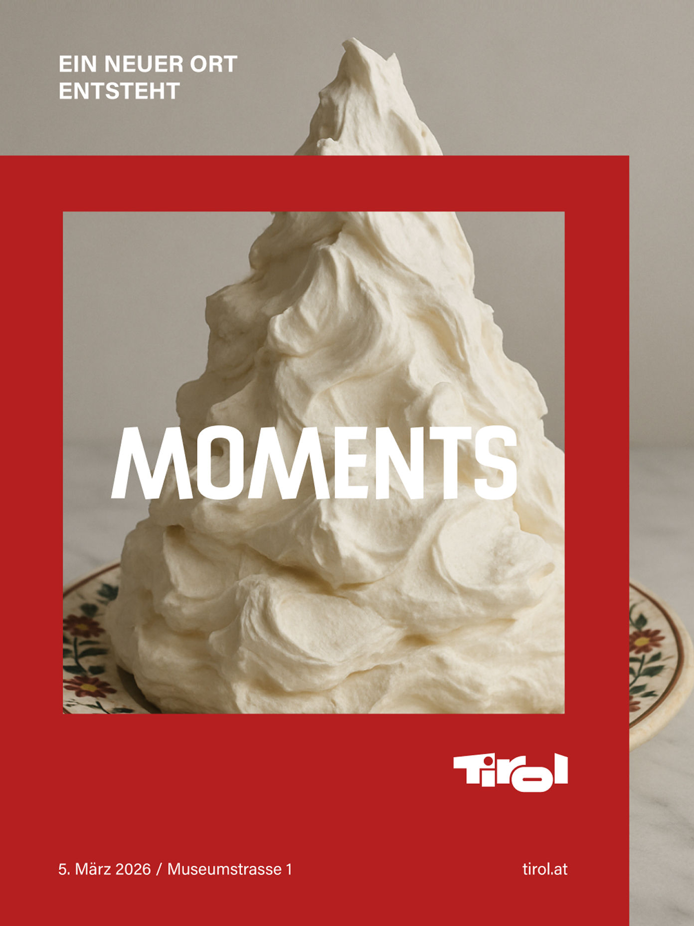
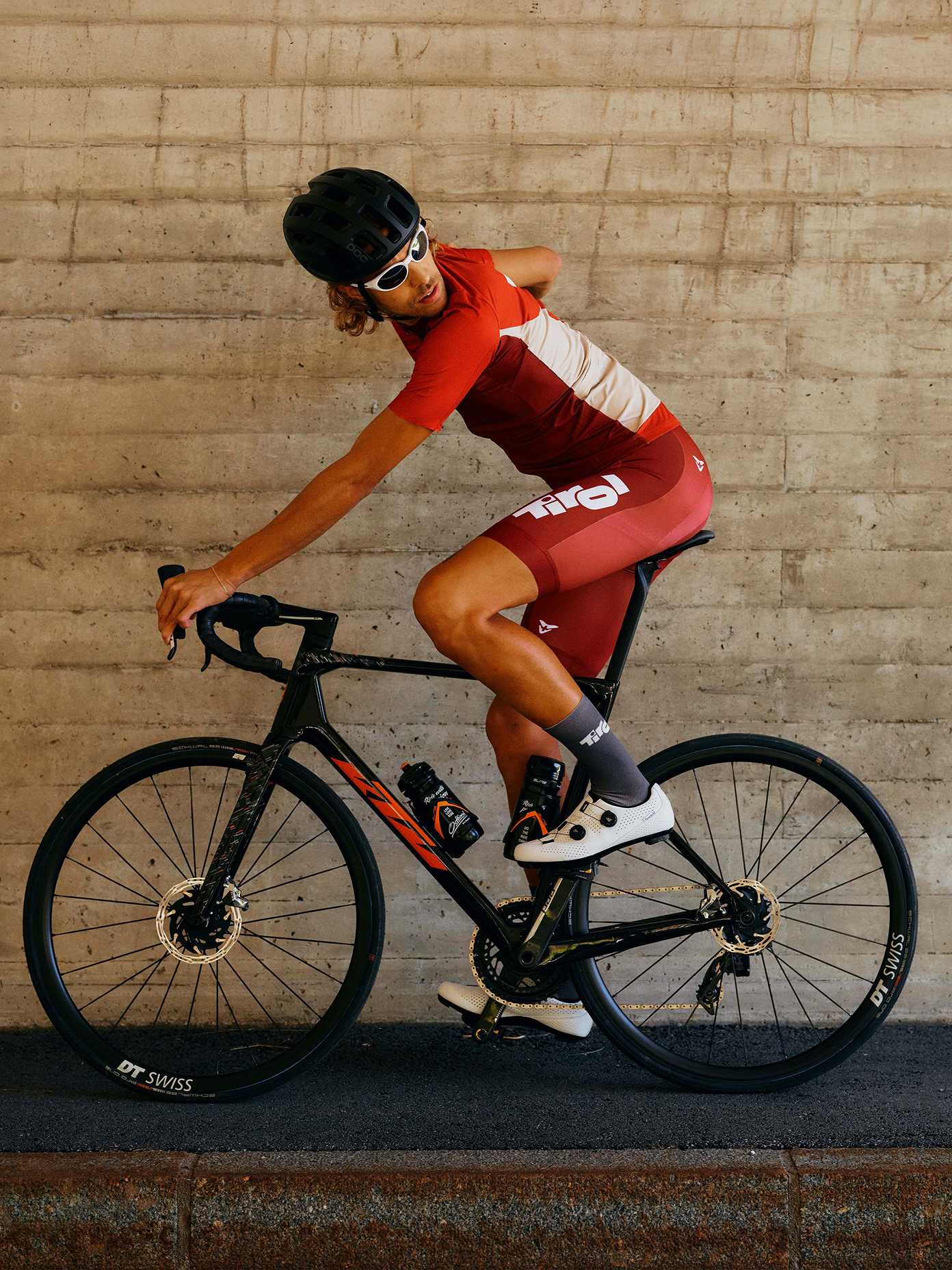
Framing that moves, extends and adapts, the “Window to Tirol”, became the flexible spine of the tyrol.com redesign, extending into templates for social media and digital out-of-home, motion and animation systems, as well as a full overhaul of the Tirol Shop concept and product range.
Throughout, we stayed a confidant to Tirol’s brand team, advising on how the identity should travel into each new channel.
Outcome: An icon of past and future
The new brand system is designed for a future well beyond posters and brochures, setting out how the Tirol name should behave wherever it turns up. In a social post, a digital billboard, a shop shelf or a moving image – same logic across every surface. Zelger’s 1974 mark was freed from its box, making its presence felt on its own, exactly as he’d always argued. We’re proud of the way the brand system has worked across tyrol.com and the Tirol Shop; the fruits of a hard, collaborative push into the future.
Learning: A heritage brand doesn’t need reinventing, just letting out
Zelger’s logo had been doing its job quietly since 1974. What was missing wasn’t a new symbol, it was rules for the places that didn’t exist when he drew it – the feeds, the screens, the shop shelves. The equity was already earned, the guidelines just needed to catch up to it.
Impact: Jetzt vor Ort und online
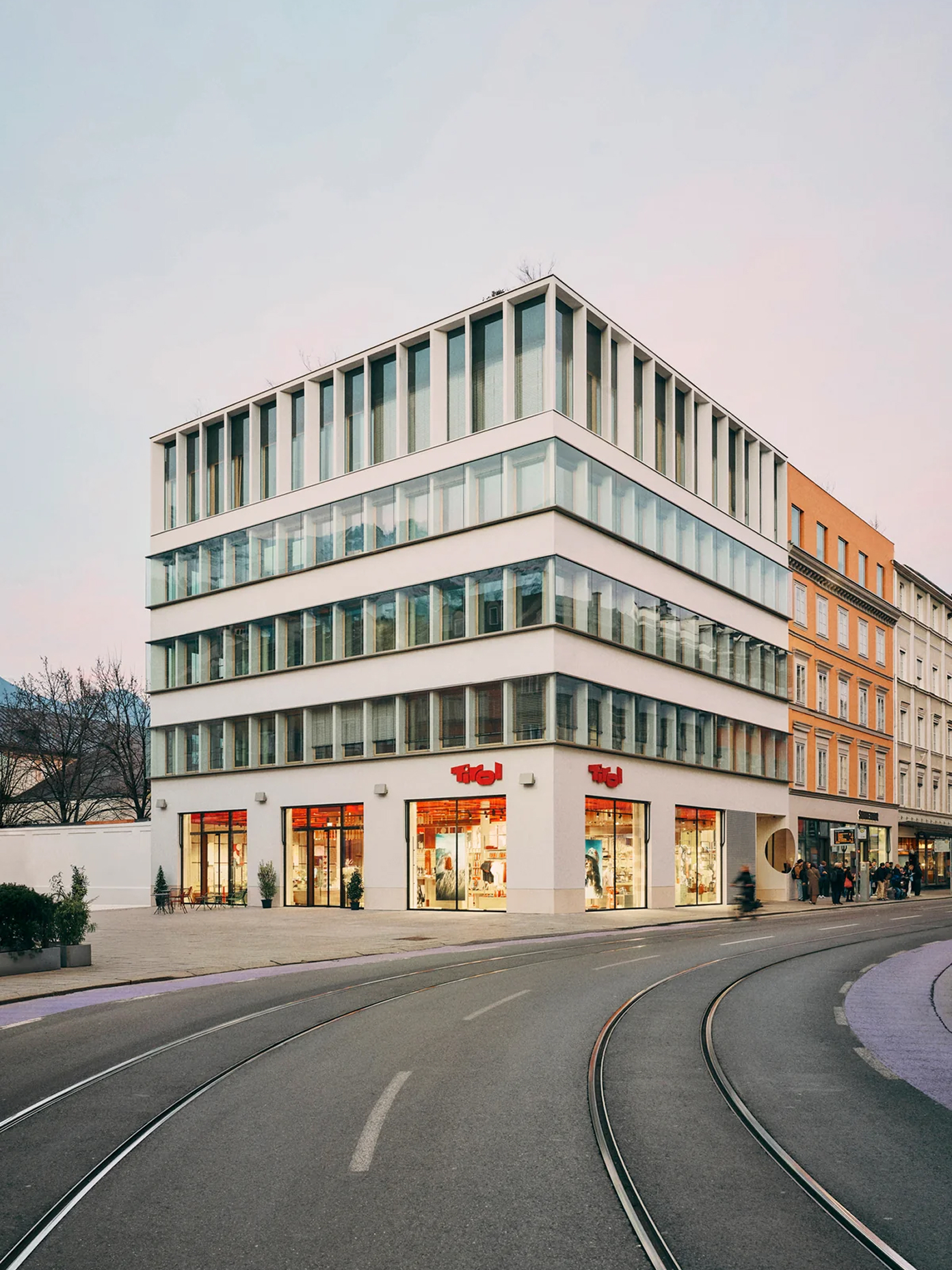
New tyrol.com went live and the rebuilt Tirol Shop in Innsbruck opened in March 2026. Between them, this is where the shift Tirol asked for in 2022 stopped being a guideline and became something people can walk into or click through.
The same stretch saw Tirol’s broader numbers move the way work like this wants to: gross regional product up around 8.6% between 2022 and 2024, net migration into the region of roughly 13,000 people over the same span, and visitor numbers up by about 0.7 million trips and 1.1 million overnight stays between 2022 and 2025 (source: Statistik Austria, Land Tirol and Tirol Werbung). Regional trends are shaped by more than one brand refresh, but Tirol is showing up there with a brand it can yodel about from the highest tops of the Alps.
Regional trends are shaped by more than one brand refresh, but Tirol is showing up there with a brand it can yodel about from the highest tops of the Alps.
Up next