

Kyrö Distillery: The national treasure
Challenge: Kick-starting a distillery culture in Finland
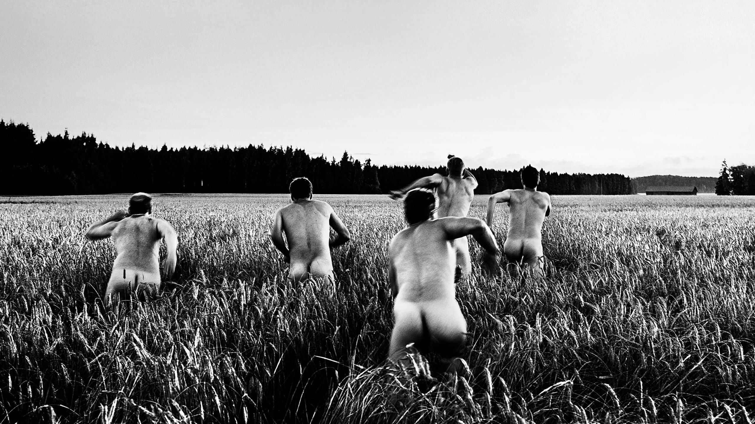
The story of Kyrö Distillery begins in 2012. Rye whisky was being tasted in a sauna, and a simple question surfaced: why doesn’t Finland distil rye — when Finns consume more of it than anyone else in the world?
Rye has grown in the harsh Finnish climate since the Iron Age. It has been part of our meals and lives forever. The rye bread has even been named Finland’s national dish. And yet, when it came to distilling, rye was strangely absent.
The reason had little to do with the grain itself. Finland’s relationship with alcohol is complicated to say the least. Shaped by regulation rather than lack of it. Ever since Finland’s prohibition era, which finished in 1932, alcohol manufacturing and distribution have been heavily state-controlled. This is because of the predicted damage to public health if it were any easier to get drunk. Perhaps it’s genetic.
When Finland joined the European Union, things liberated a bit, but our alcohol marketing law is still one of the strictest in the world. Basically, you can’t advertise. This caused some challenges for the newly found distillery, but also focused the minds to do some very creative brand building.
Distilling wasn’t an obvious path forward — which made the idea all the more ambitious. To put it mildly, you need to be mad to even try.
Approach: Perfect matrimony of trust and talent
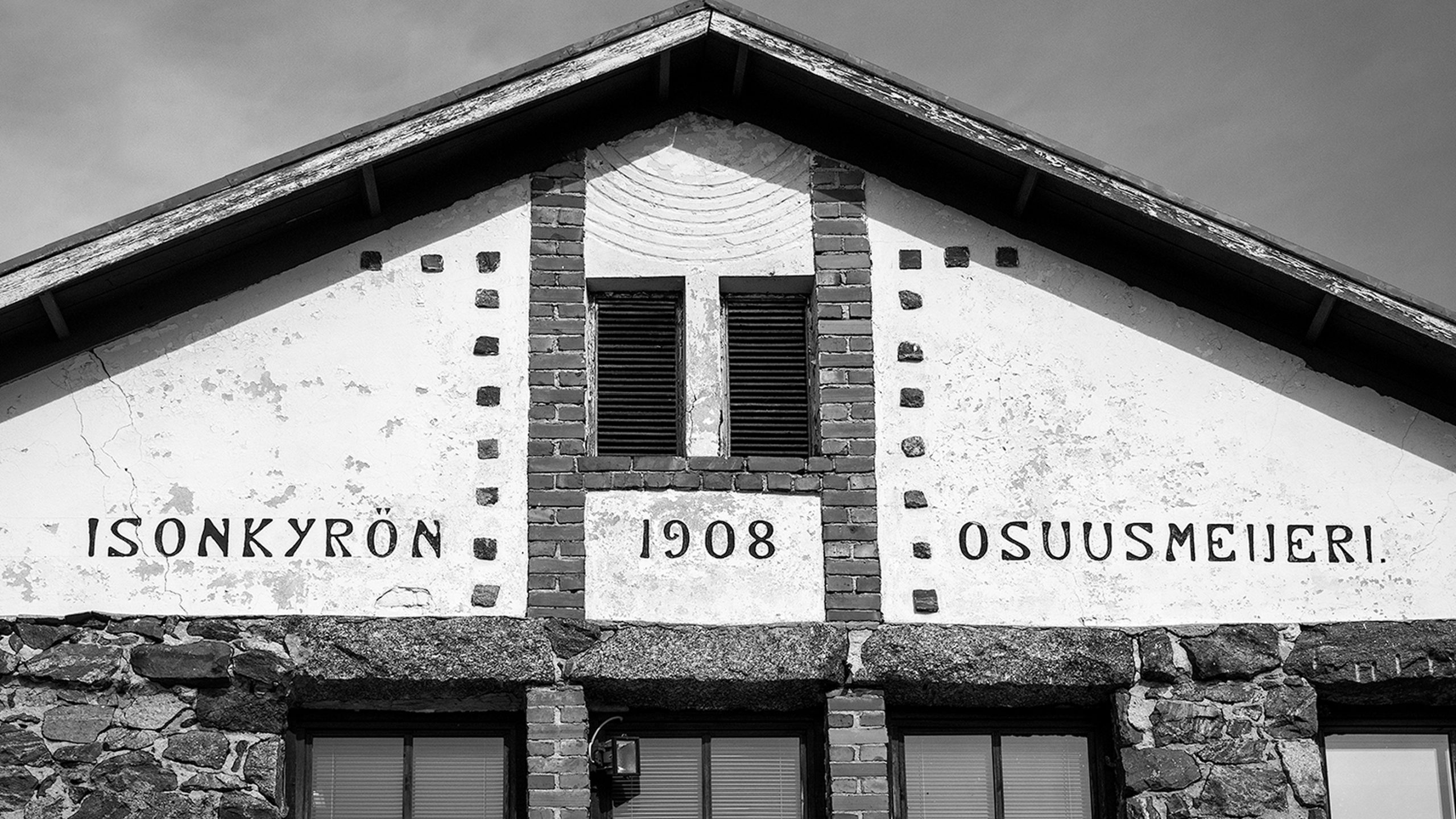
Brand creation started at the distillery, an old dairy in Isokyrö that once had produced the most popular Finnish cheese, Oltermanni. Workshops were held, photos were taken, and rough sketches for the brand and its identity started to emerge. Pretty soon, we picked up on the fact that even if there wasn’t much of a distillery history in Finland or Isokyrö, there was a lot of history. We decided to build the brand on the local roots, heritage and of course war stories.
There was a shared feeling that this unusual, but truthful mix could stand the test of time and appeal to both Finns and non-Finns.
The relationship between Kyrö Distillery and Werklig has been hot like a sauna from the very beginning. The way of working has had very few or no boundaries between the client and the agency. We complete each other’s thoughts and ideas. Which is lovely. We continue to work on the Kyrö brand daily, creating arresting visual assets or devising canny strategies.
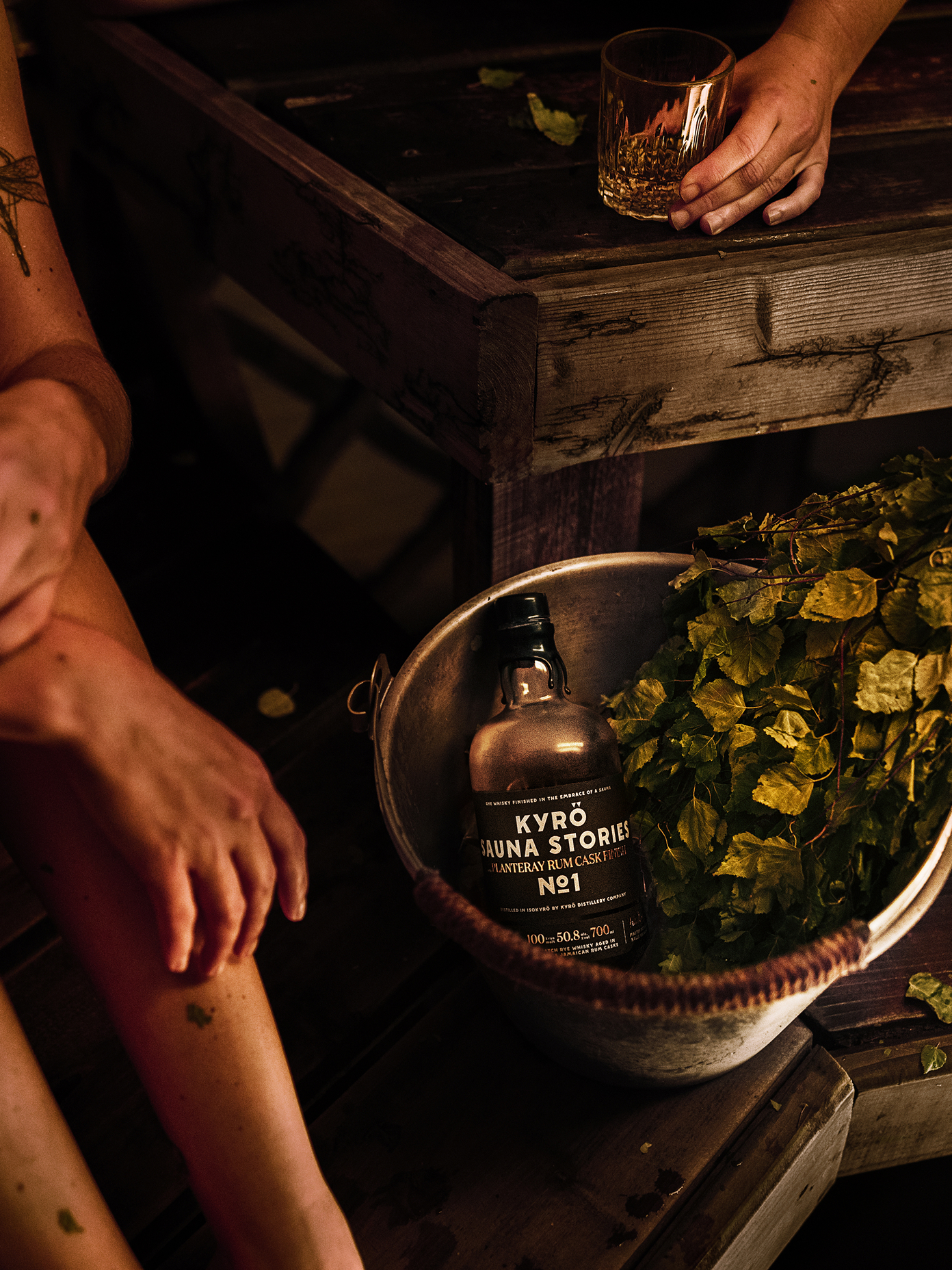
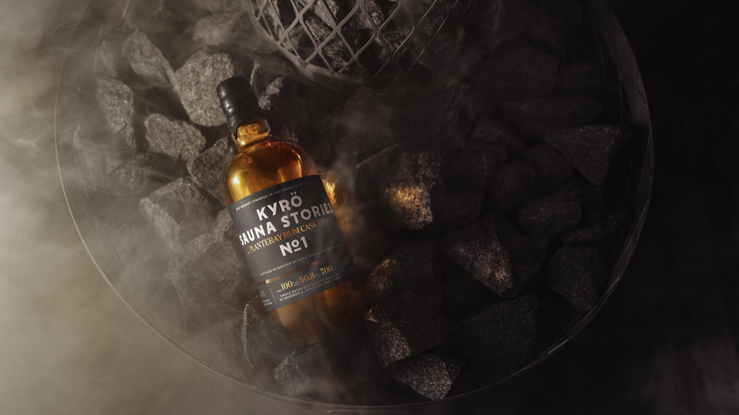
In addition to ongoing brand work, we helped reposition Kyrö radically in 2018. To take Kyrö Distillery global, with a bang. Some bold decisions were made. Awarded and iconic bottles were replaced with new styles, and the drinks portfolio was reconfigured with a new naming system.
Outcome: Land distilled into the brand
We built the foundations – Kyrö values, purpose and tone-of-voice – together with the founders. The strategic principles lead to visual discovery and a solution for how to translate Kyrö’s ideology (= brand strategy) into a tangible form.
Kyrö brand is strong, simple and straightforward, yet filled with references to local legends. Striking simplicity makes the Kyrö identity both atypical and timeless, while the layered and half-hidden meanings are its heart and soul. Longevity is crucial for a whisky business. The brand, like whisky, should get better with age.
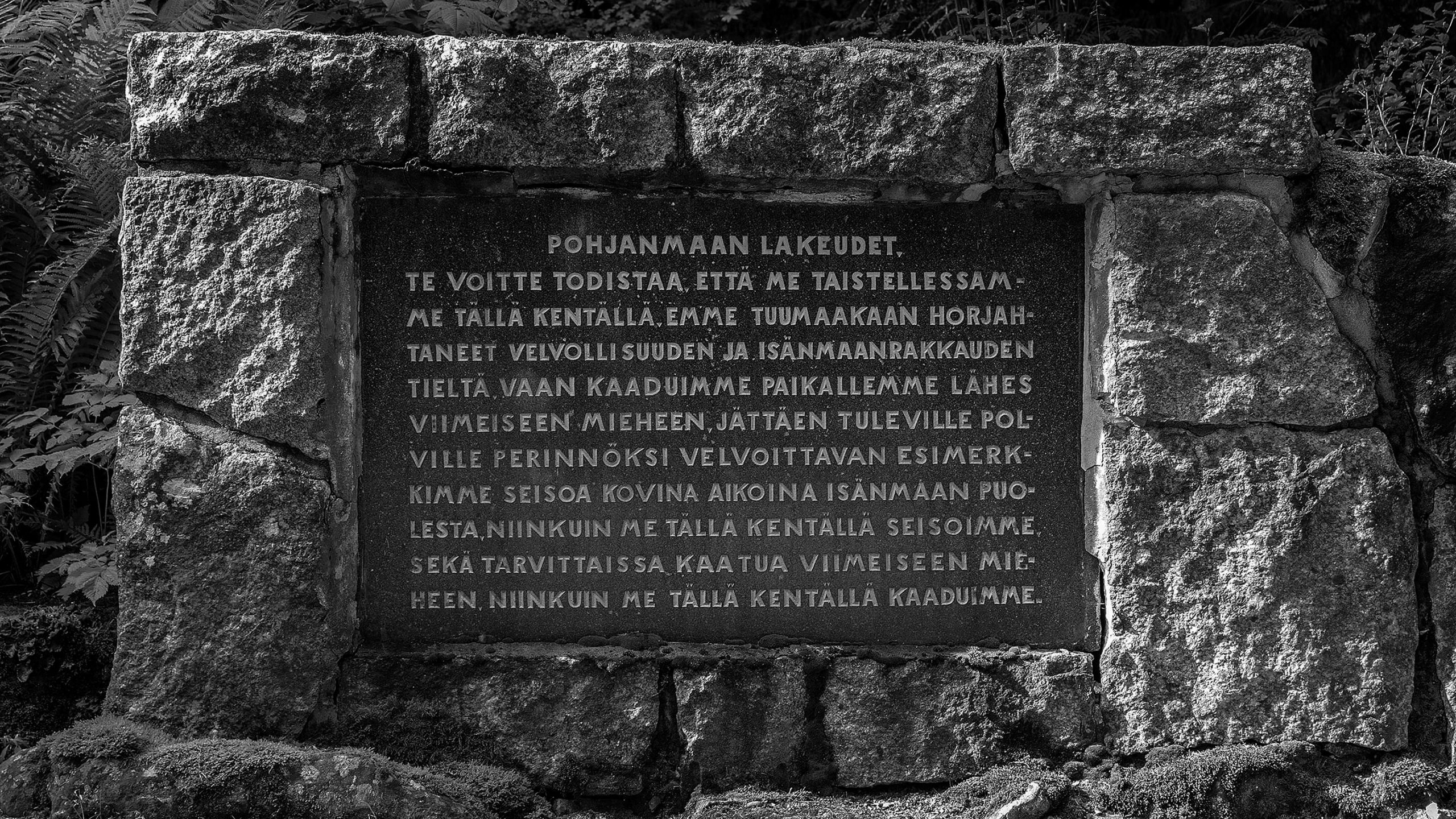
Near the old dairy, there was a bloody battle in 1714 called the Battle of Napue. In truth, a massacre by the Russian army, where 3000 Finns lost their lives. No doubt this era, also called the Big Hate (or Greater Wrath to be historically accurate), has something to do with the hardy edge of the local people. There’s a war memorial just a couple of hundred meters from the distillery. That stone memorial became a true keystone for the brand – both literally and metaphorically.
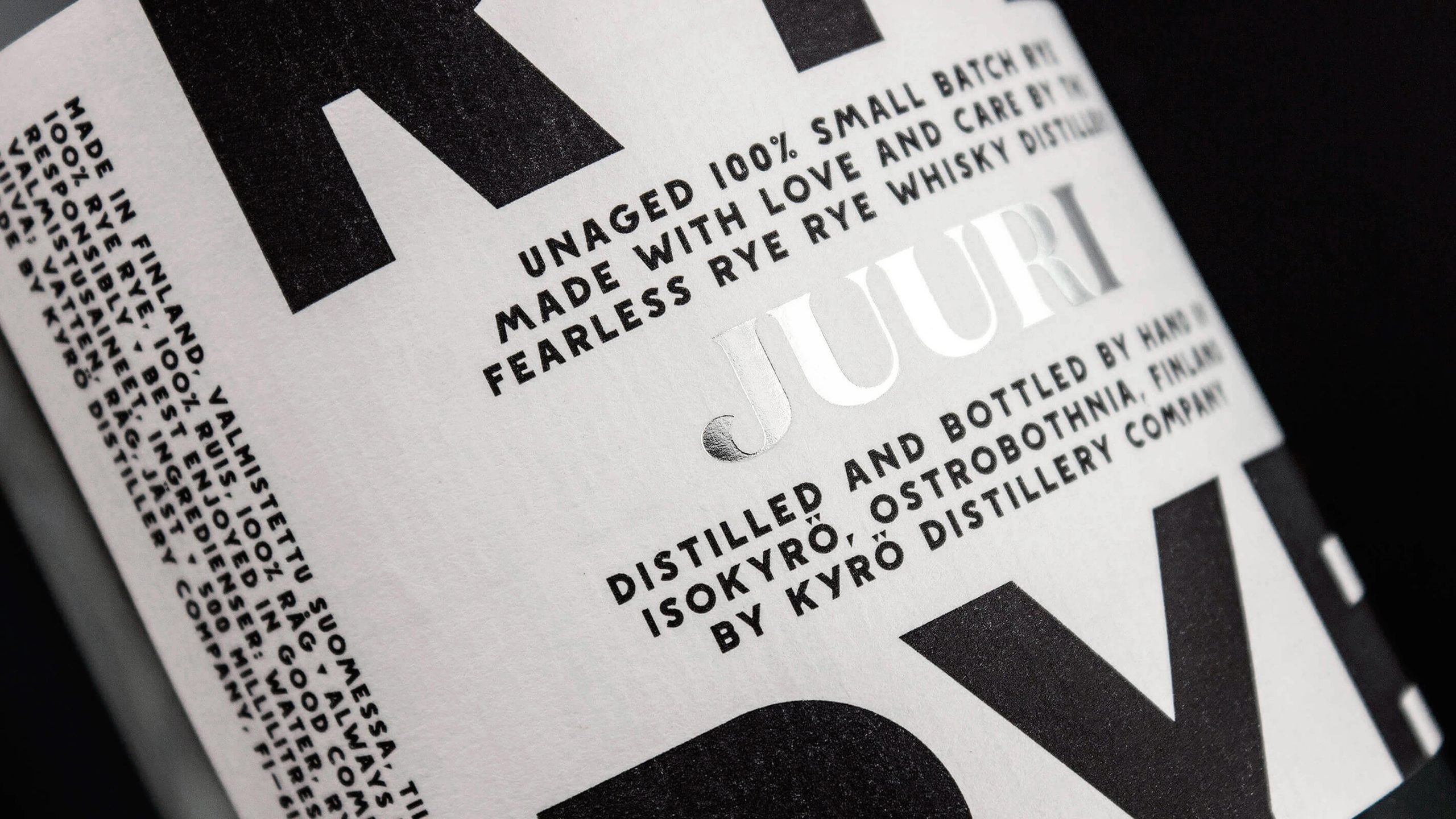
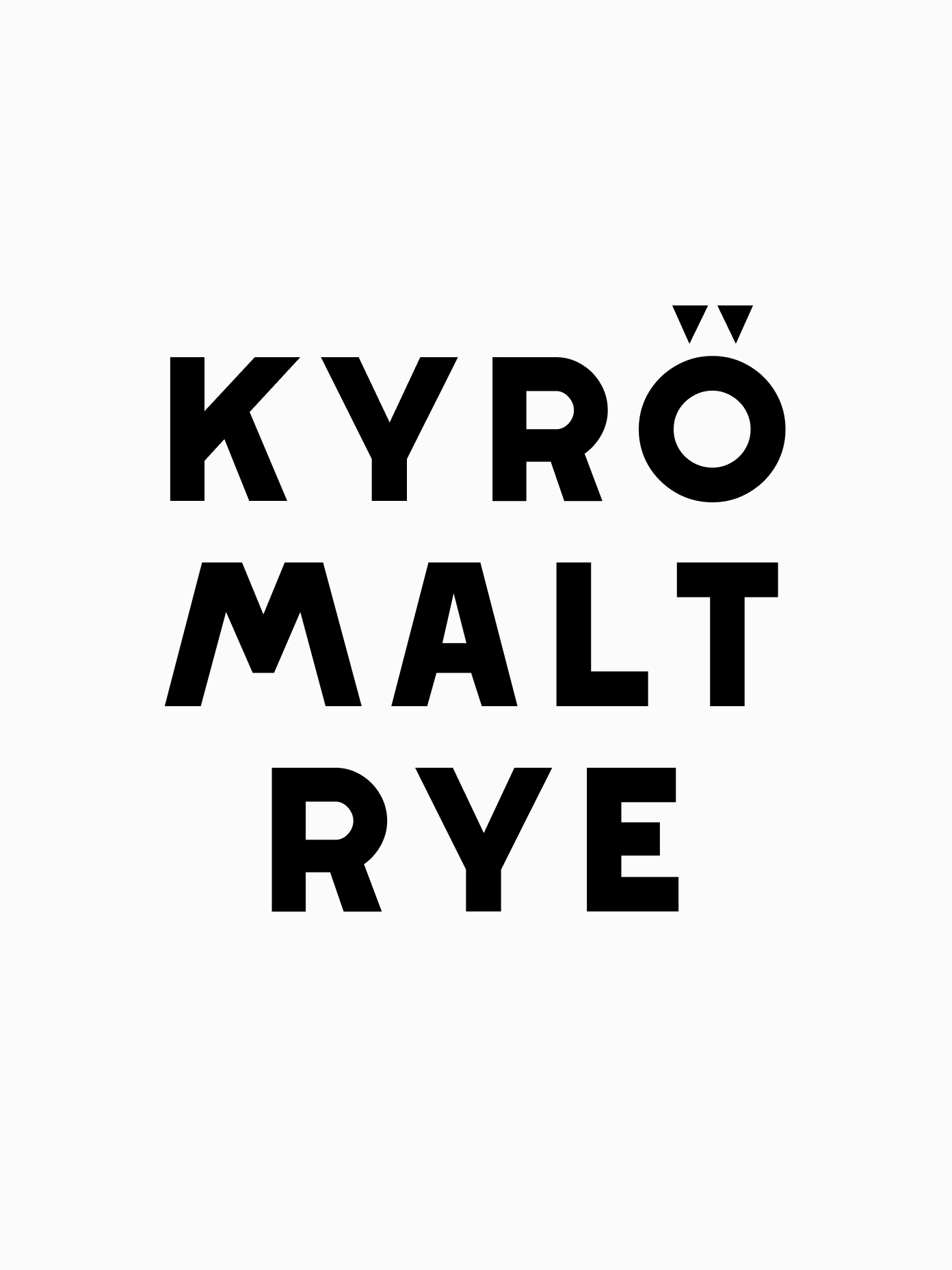
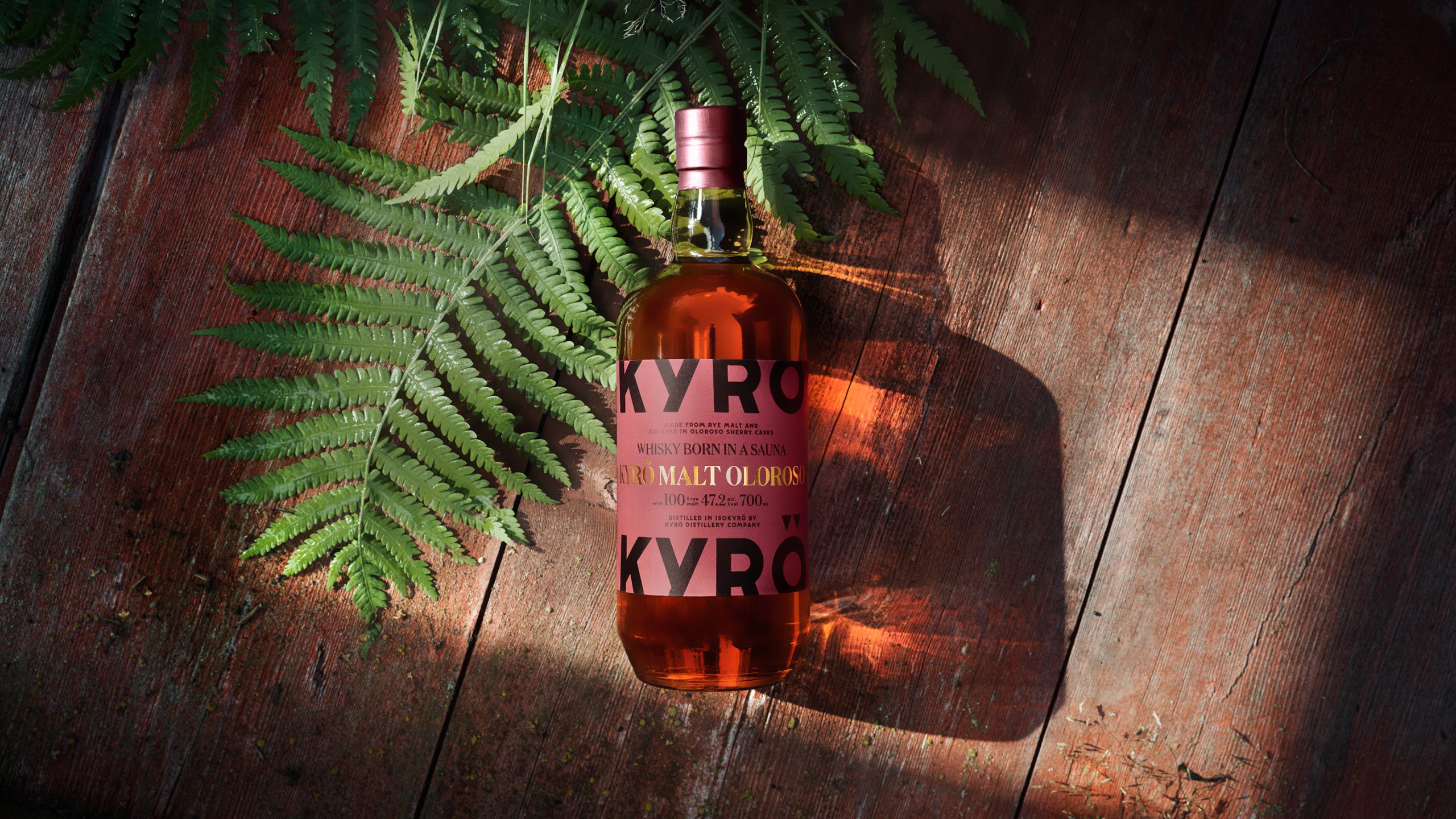
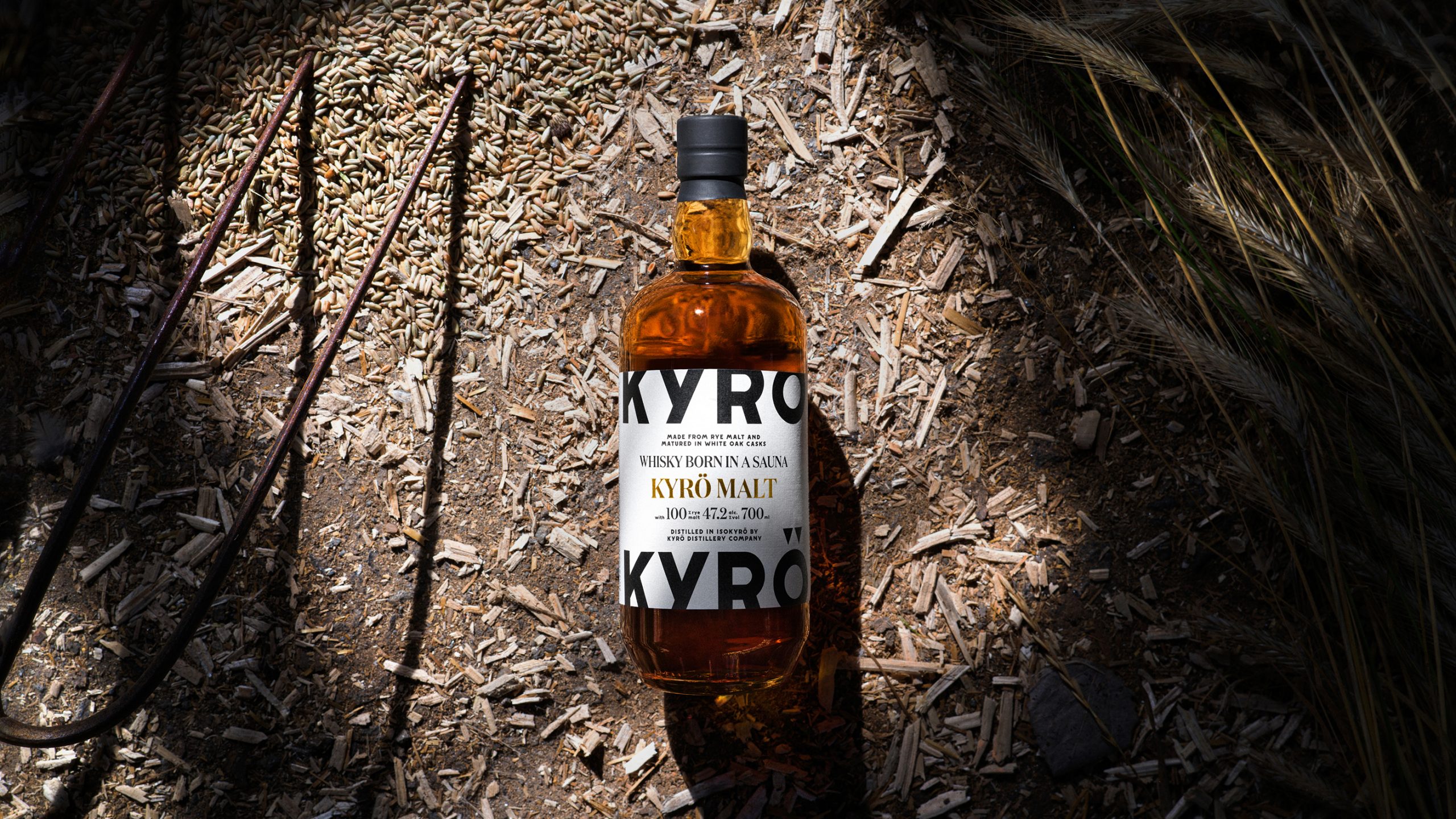
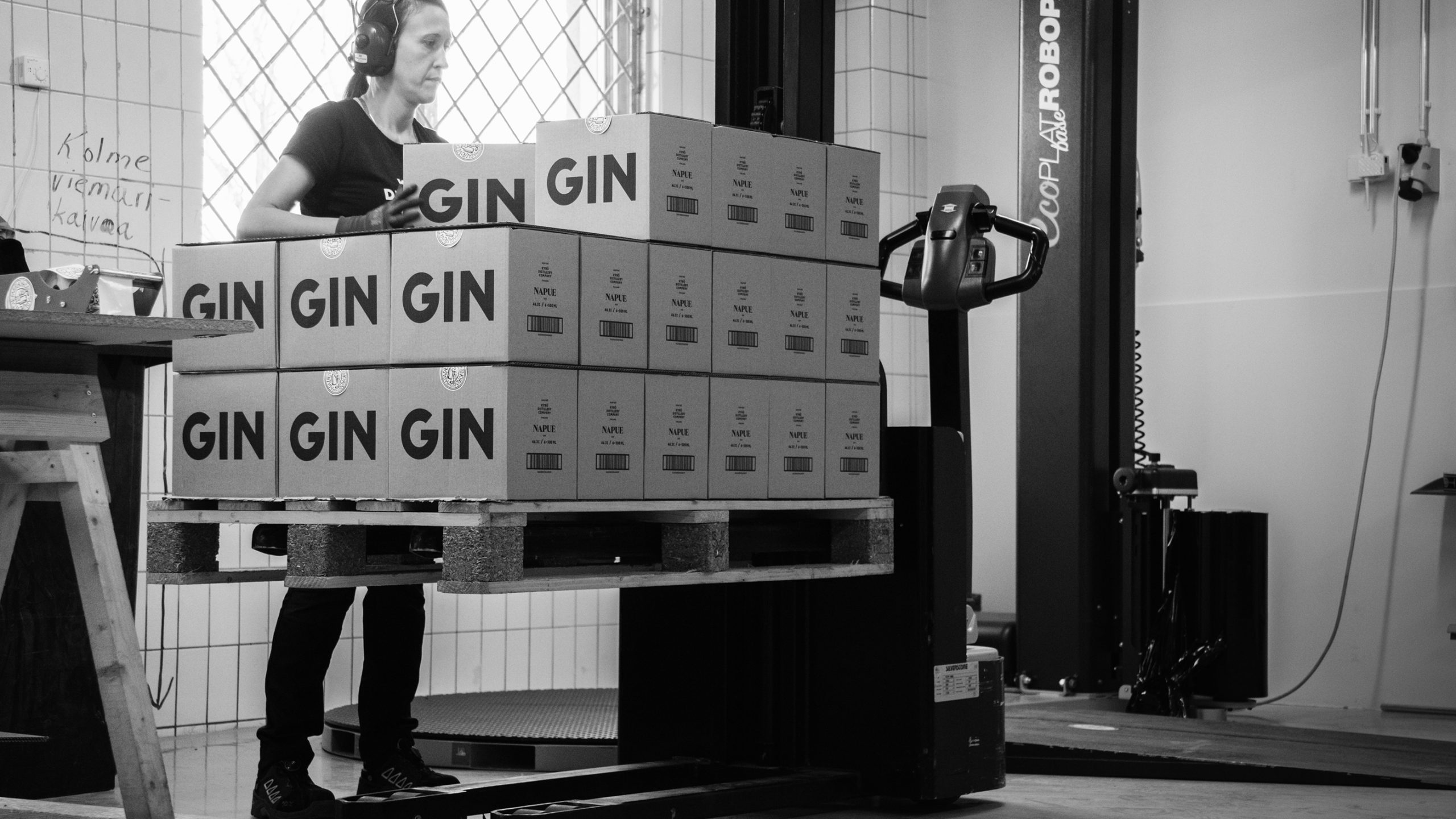
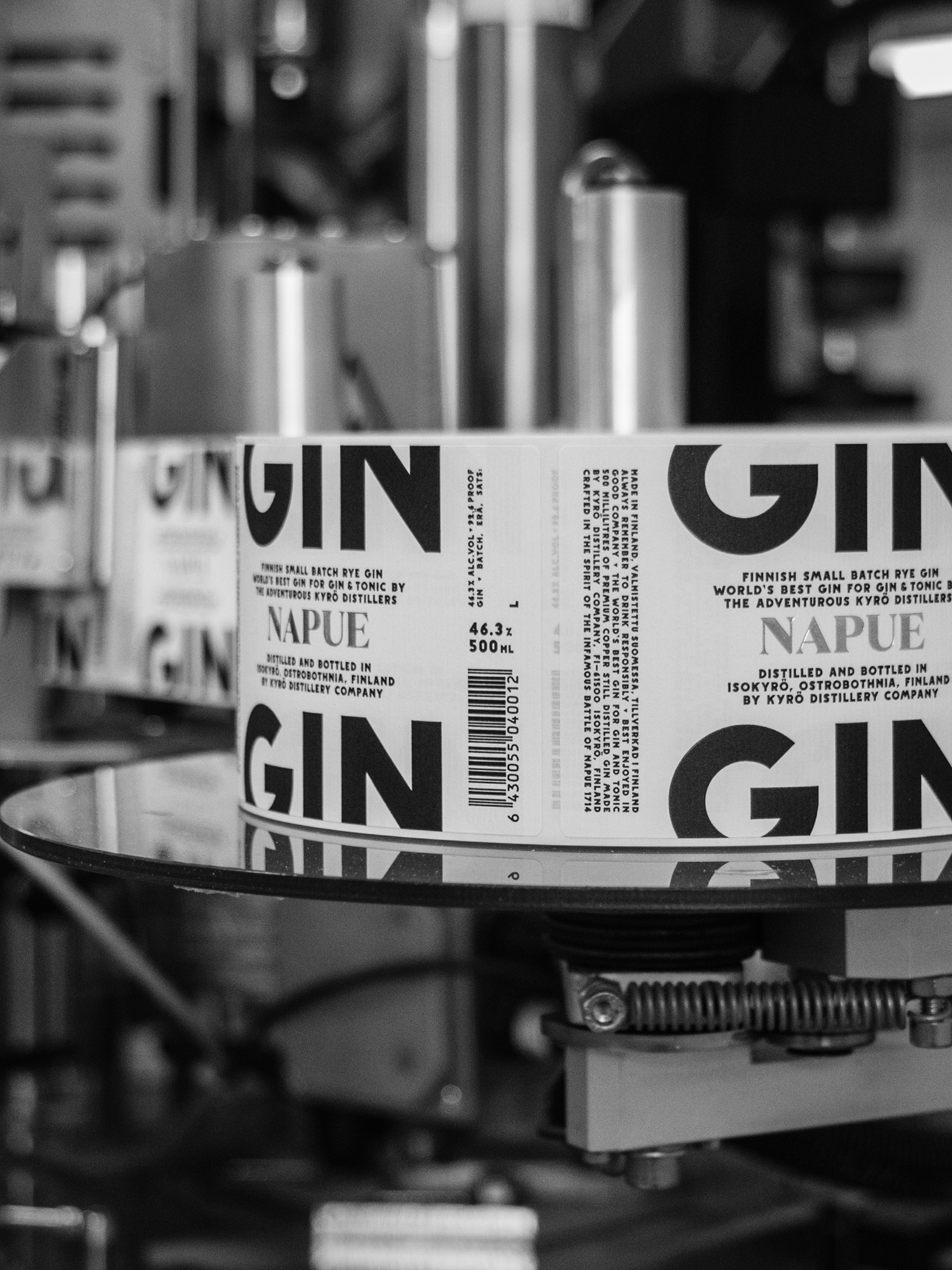
In order to bring the “terroir” and love of the homeland into the brand, a custom typeface Napue Sans was designed, based on the stone engravings of the Battle of Napue memorial. It’s used prominently across all Kyrö products.
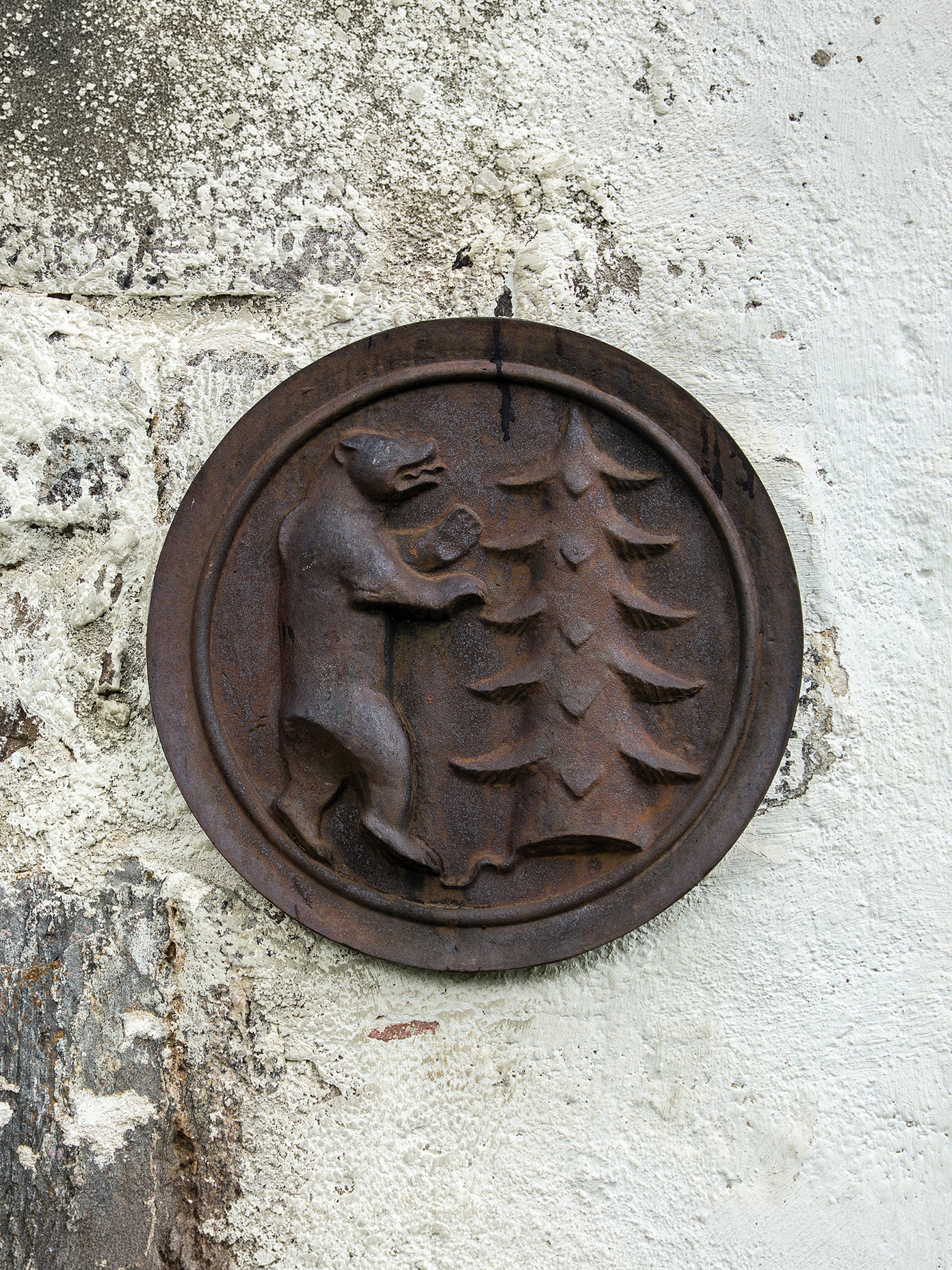
Another story for the sharp-eyed is Kyrö’s Seal of Approval. The Seal is based on Isokyrö’s coat of arms that features a bear hugging a tree. In Kyrö’s version the bear has been replaced with a seal hugging a bottle, in a medieval style. Latin text around the emblem says AQUA·VITAE·FABRI·KYRÖ, loosely translated as ‘Whisky Makers of Kyrö’.
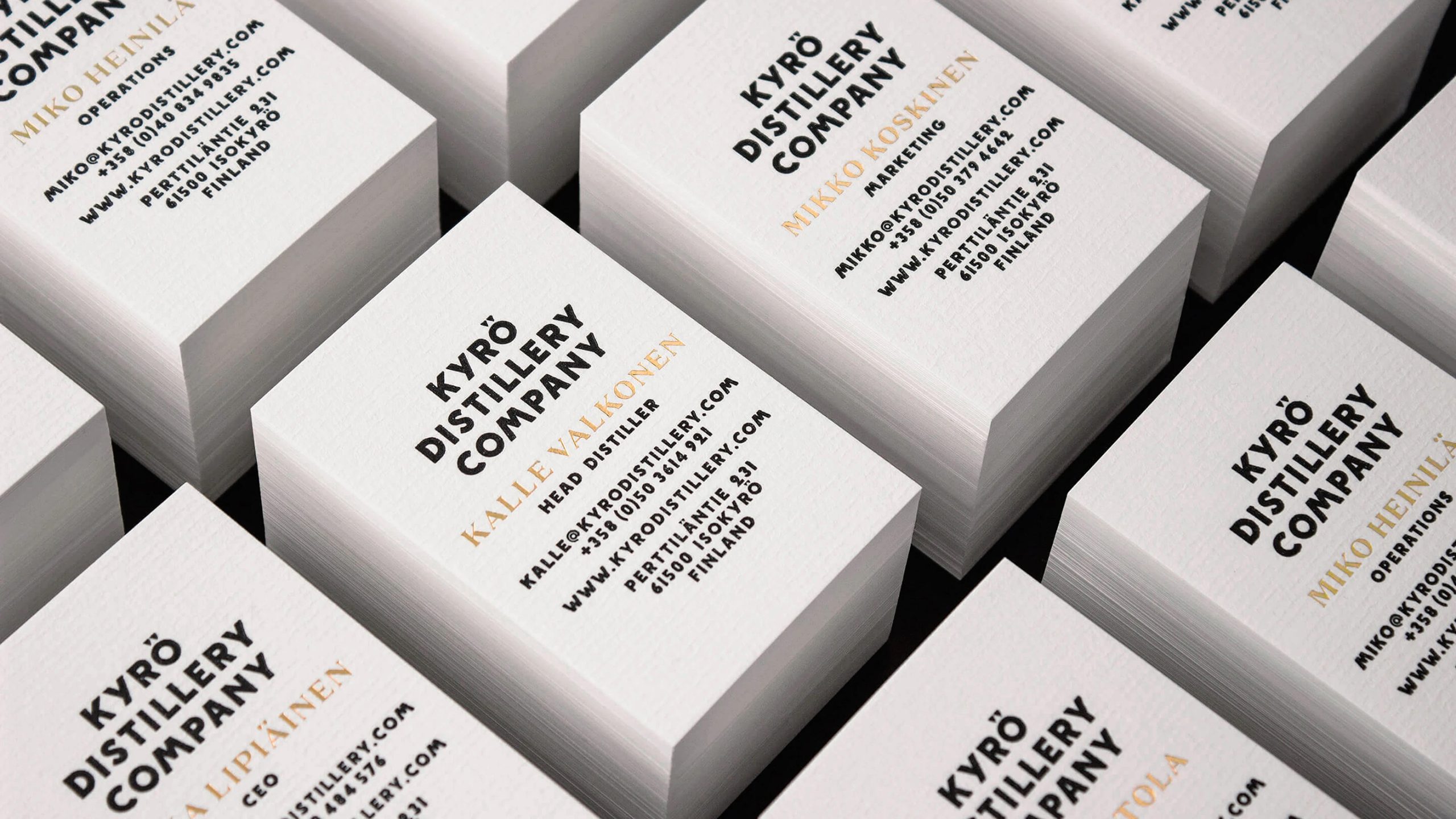
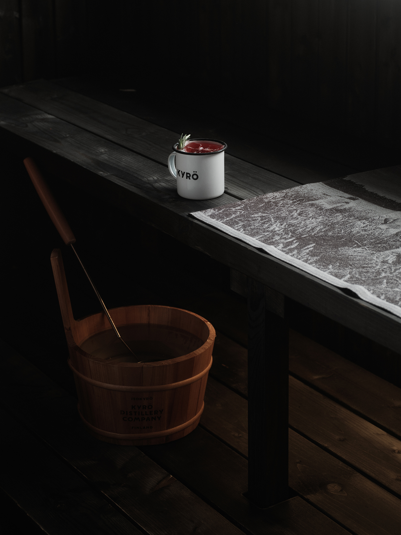
The colour palette is minimalist — suitable for communicating the range of spirits. Unpolished materials, such as textured paper, are paired with silver and gold foil print. Silver accents represent clear spirits, gold for whisky and copper for other matured spirits.
Impact: From a local curiosity to a national treasure
In 2015, Kyrö Napue Gin was named World’s Best Gin for a Gin & Tonic — a turning point that brought global attention to both the product and the brand behind it. What began as a local curiosity quickly became an international contender.
Today, Kyrö exports worldwide and is widely regarded as one of the forces behind Finland’s modern distilling culture. A reminder that strong brands don’t need to shout — they need to know where they stand. And behind every good idea is a healthy dose of mad.
In order to bring the “terroir” and love of the homeland into the brand, a custom typeface Napue Sans was designed, based on the stone engravings of the Battle of Napue memorial. It’s used prominently across all Kyrö products.
Another story for the sharp-eyed is Kyrö’s Seal of Approval. The Seal is based on Isokyrö’s coat of arms that features a bear hugging a tree. In Kyrö’s version the bear has been replaced with a seal hugging a bottle, in a medieval style. Latin text around the emblem says AQUA·VITAE·FABRI·KYRÖ, loosely translated as ‘Whisky Makers of Kyrö’.
The colour palette is minimalist — suitable for communicating the range of spirits. Unpolished materials, such as textured paper, are paired with silver and gold foil print. Silver accents represent clear spirits, gold for whisky and copper for other matured spirits.