

Komero: Always heavy on the beautiful veg
Industry:
Challenge: The desperate, starving eyes looking for a fix
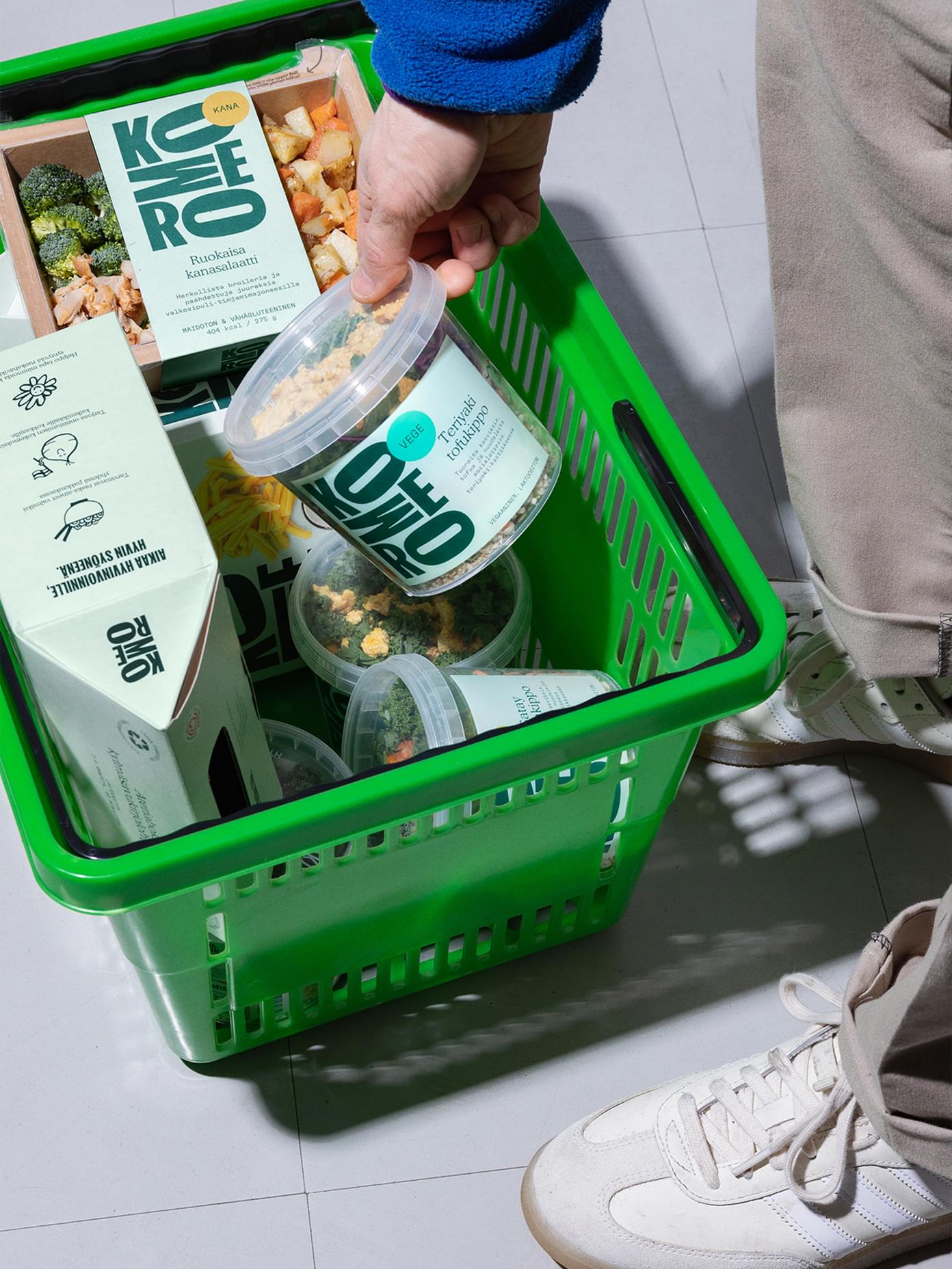
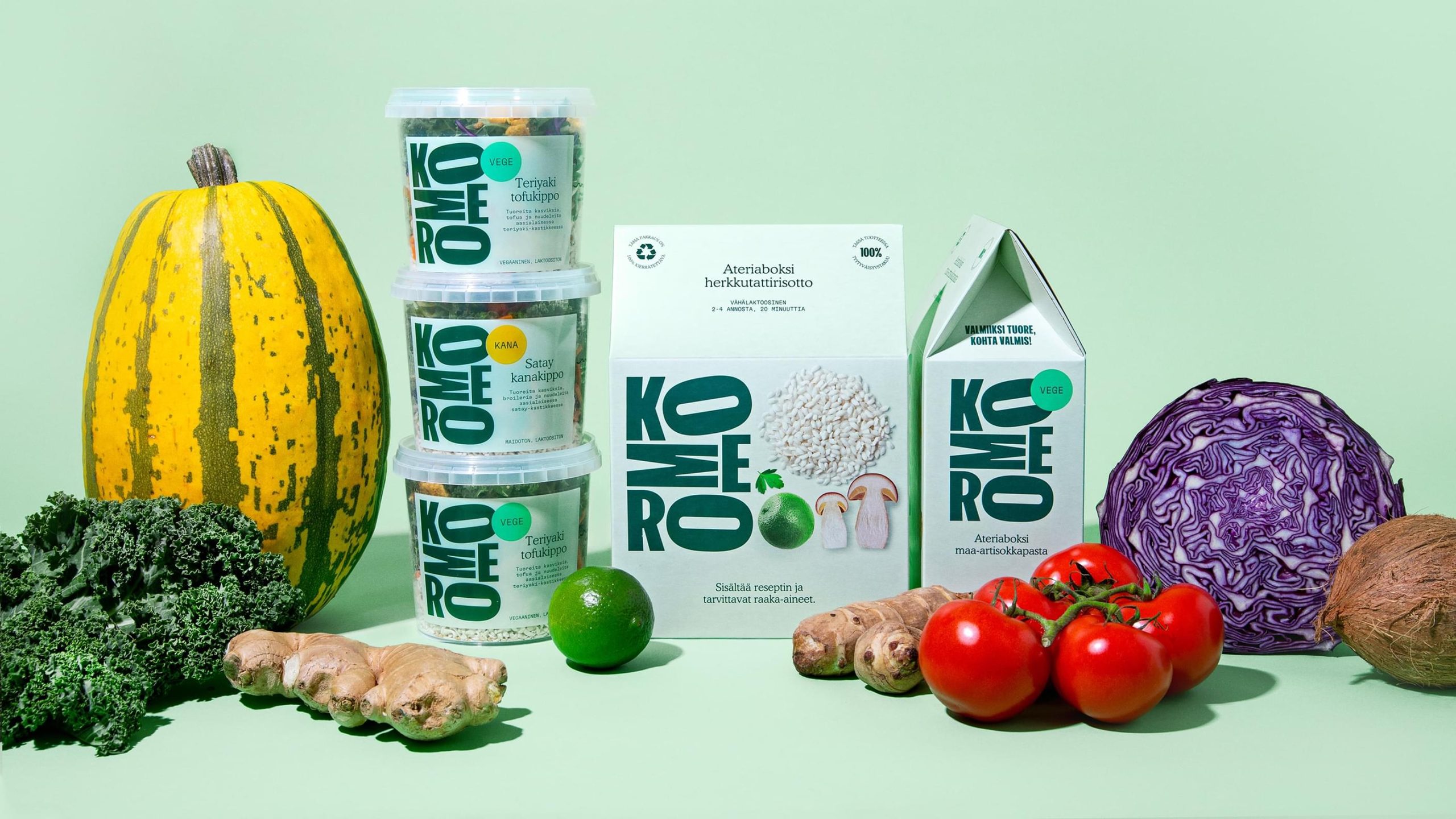
The supermarket aisles are crammed with ready-to-eat meals — infamous for their health and environmental benefits (or lack thereof). How to stand out, tell your story and convince — in those few minutes — the desperate, starving eyes scanning for a quick fix?
Approach: The only meal accelerator in the world
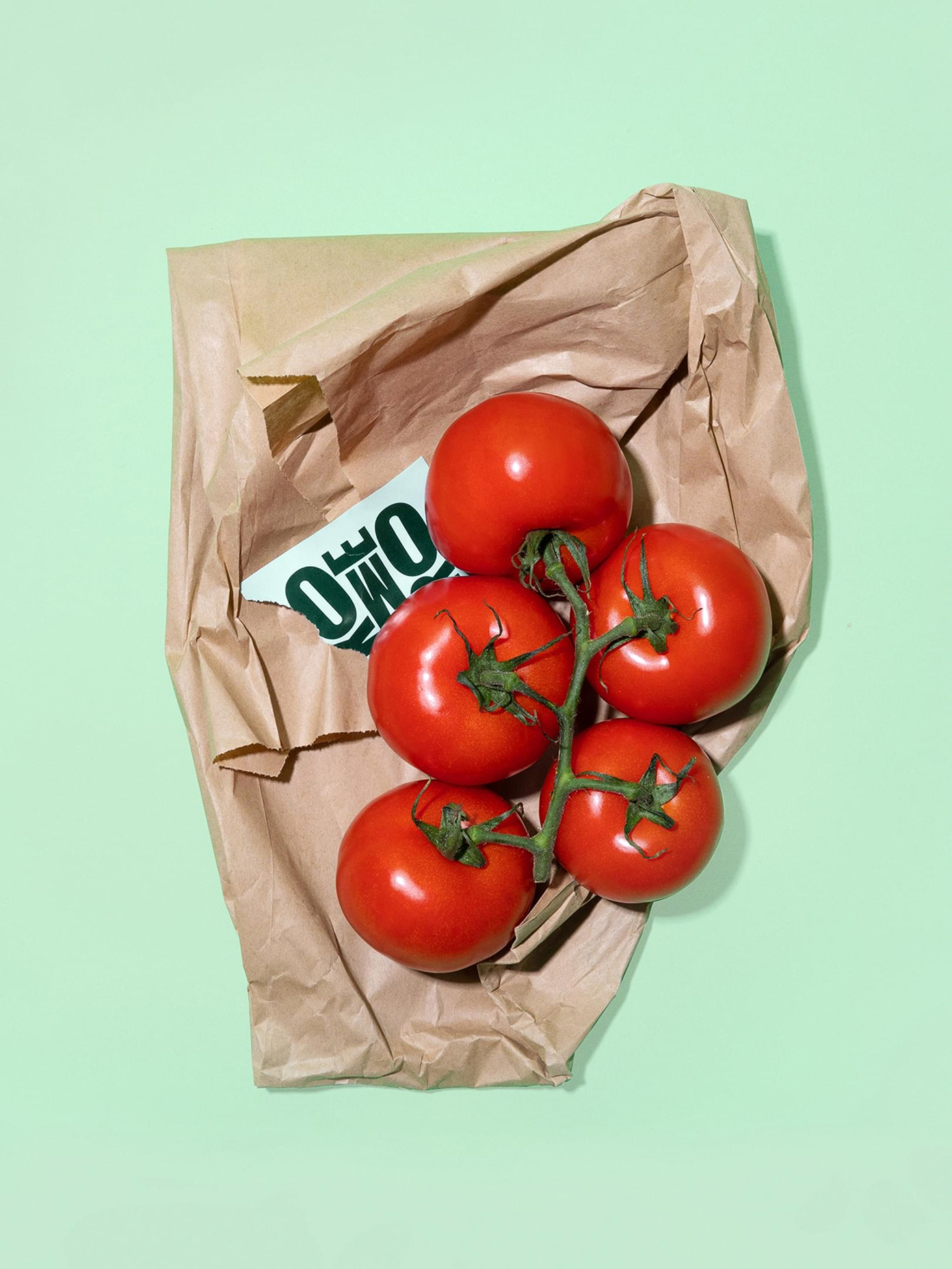
The brand-new positioning is at the heart of the creative solution — the only meal accelerator in the world. With a singular mission: feeding the hungry everyday achievers while saving time, the environment, and the heart. Always heavy on the beautiful veg.
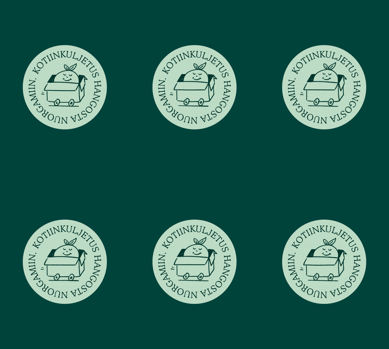
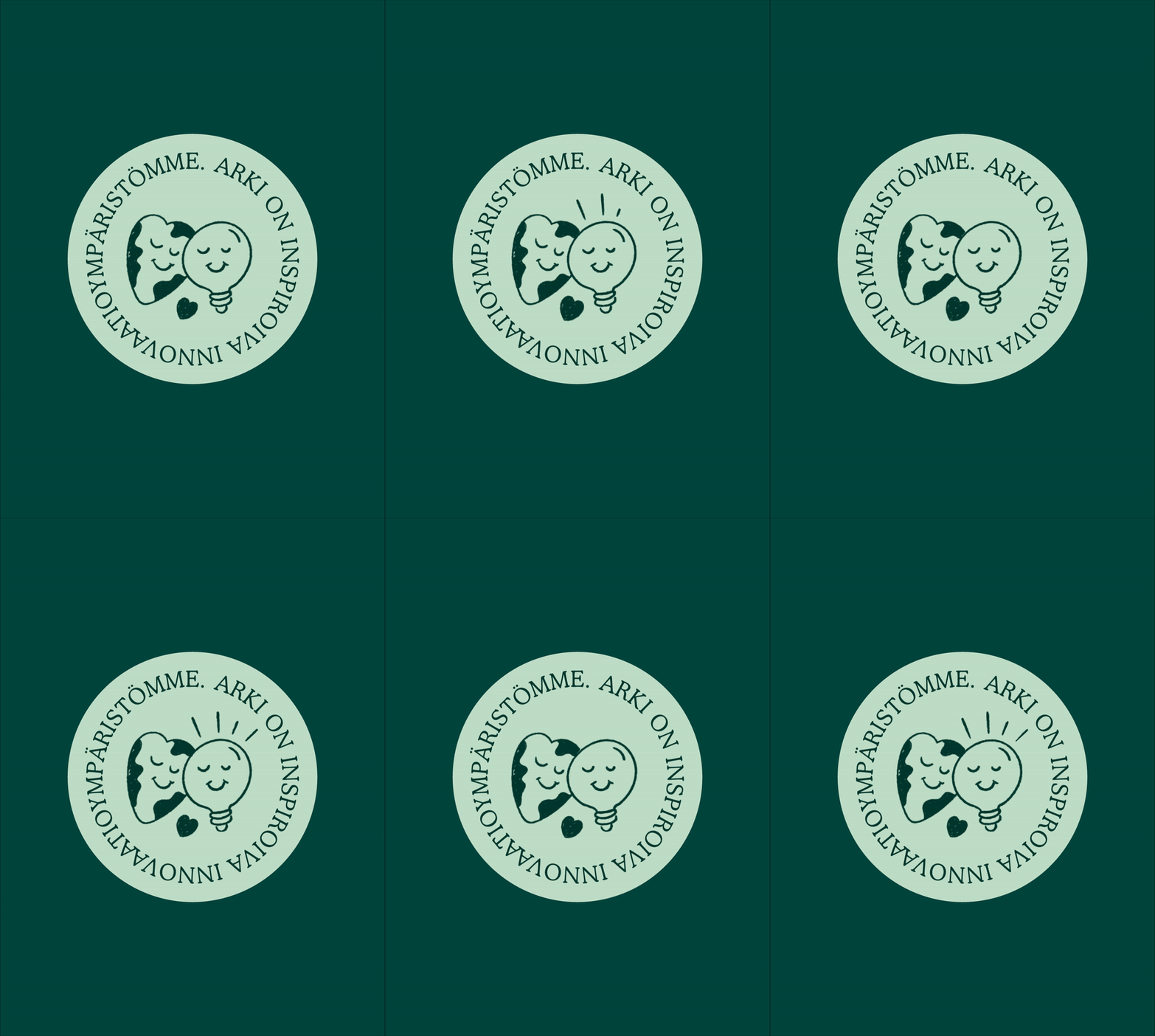
As with everything Werklig does, the work starts and ends with the values. Komero’s are well aligned to the quintessential characteristics of eastern Finns, the tribe of “savolaiset”. Affable, but stealthily sharp, all for progress, who actually give a shit about others. This is the soul of the whole identity, visual and verbal. And the North Star for how Komero always behaves.
Outcome: Big, bold and beautifully crammed
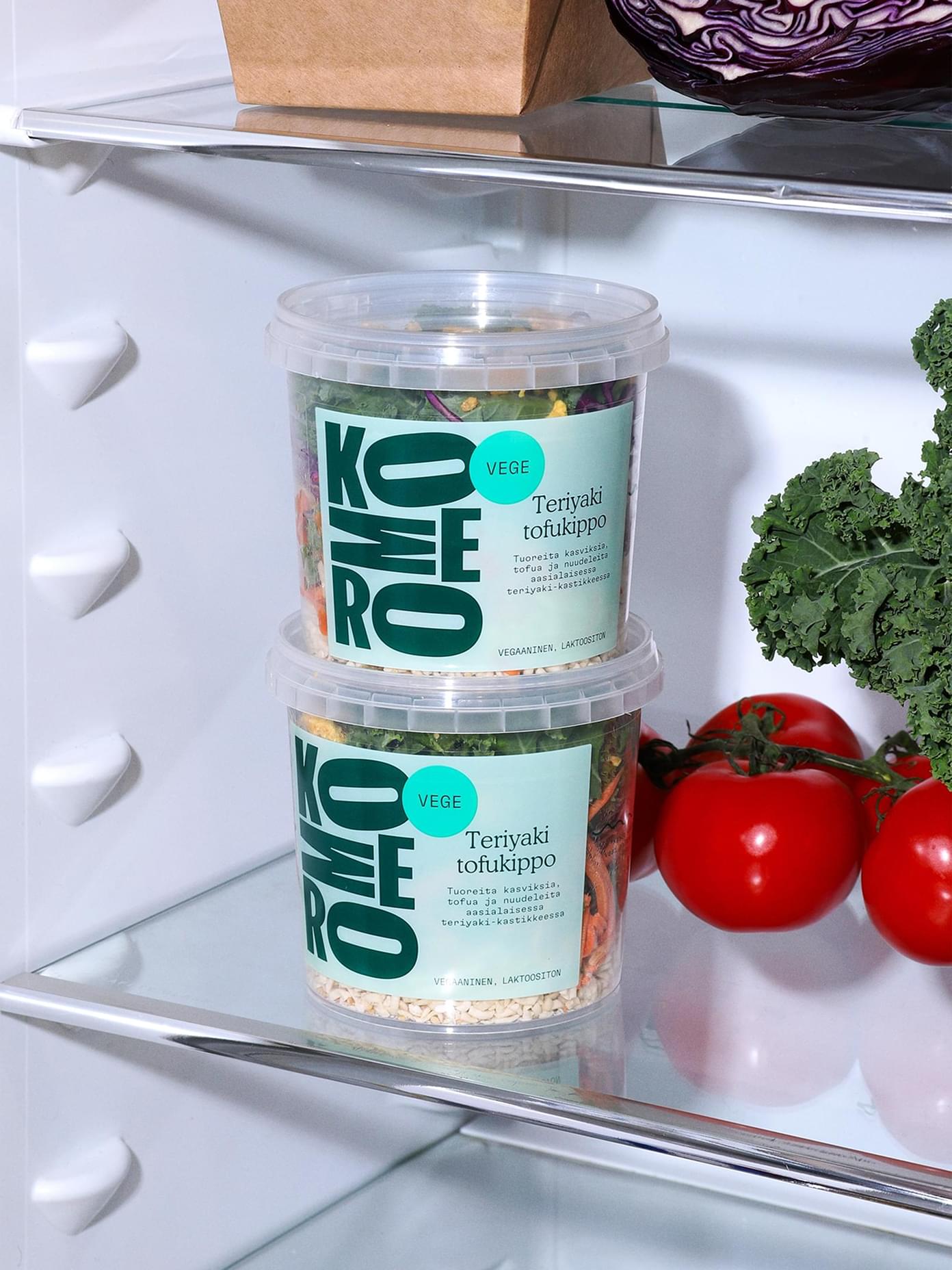
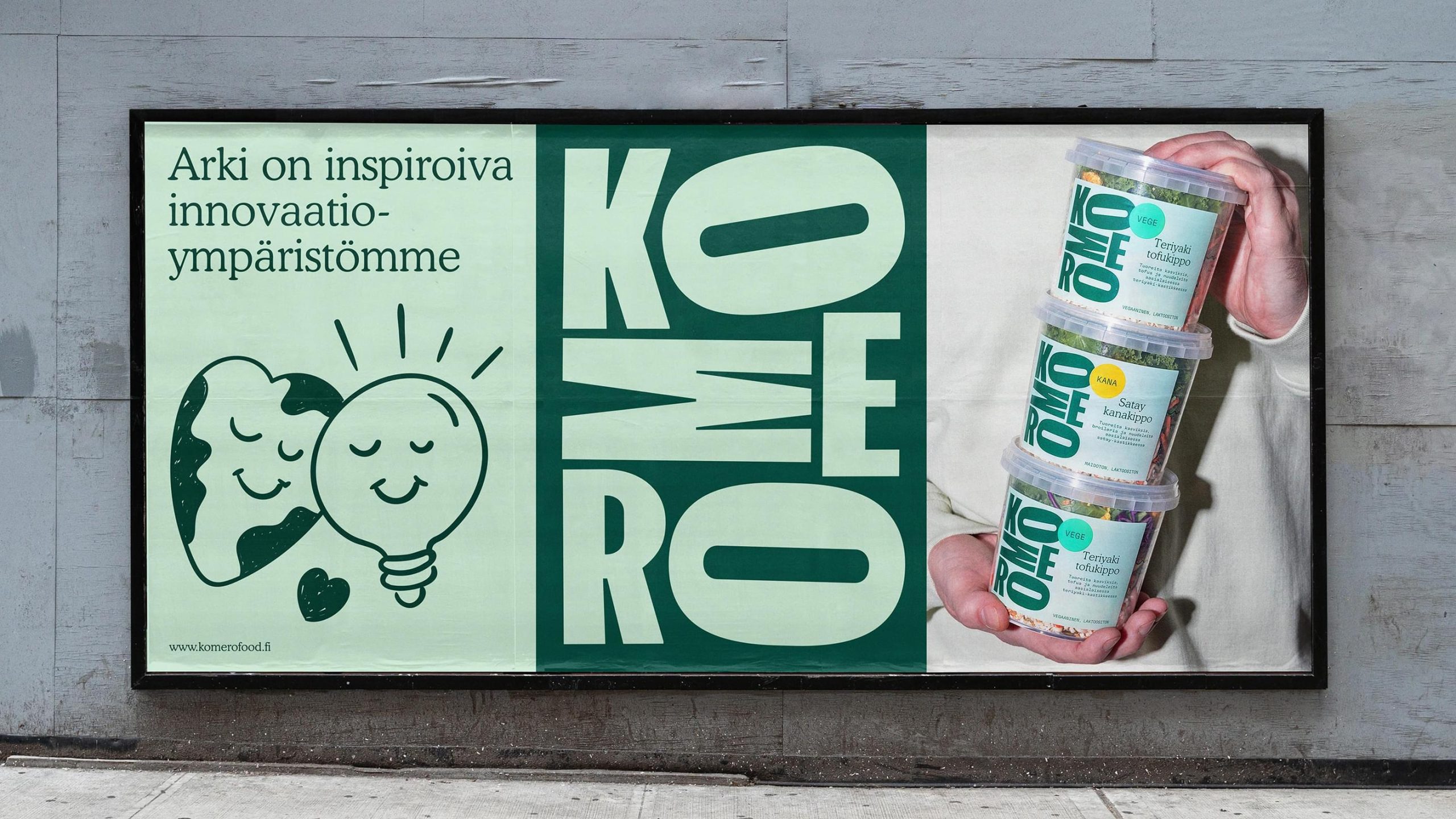
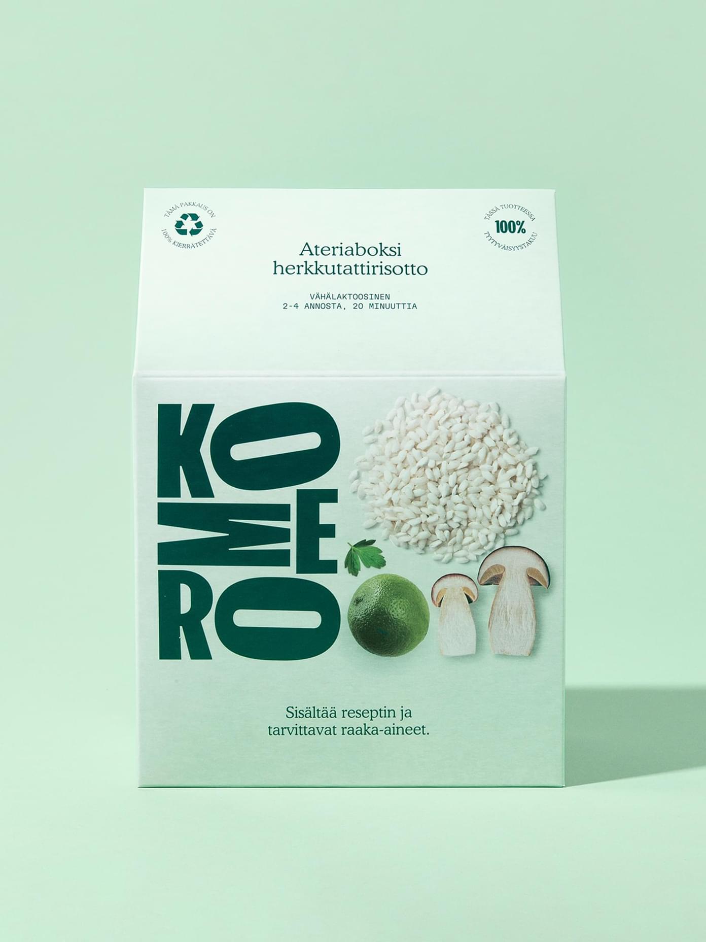
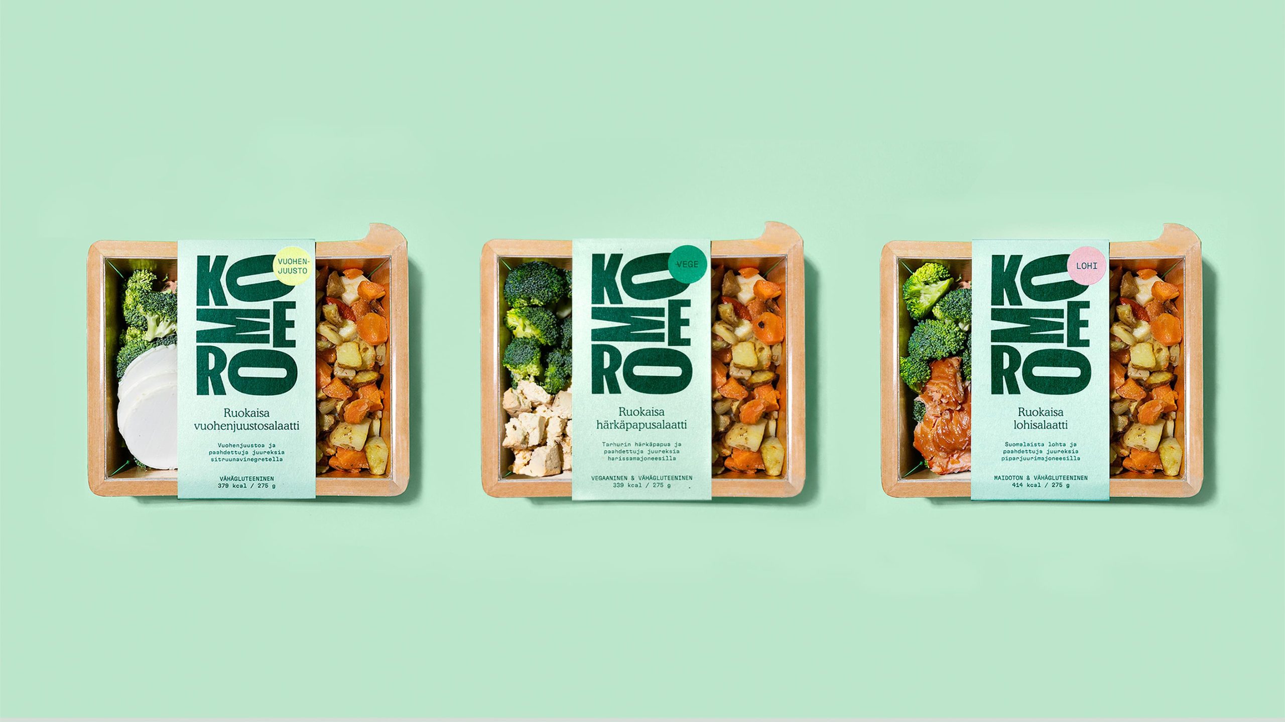
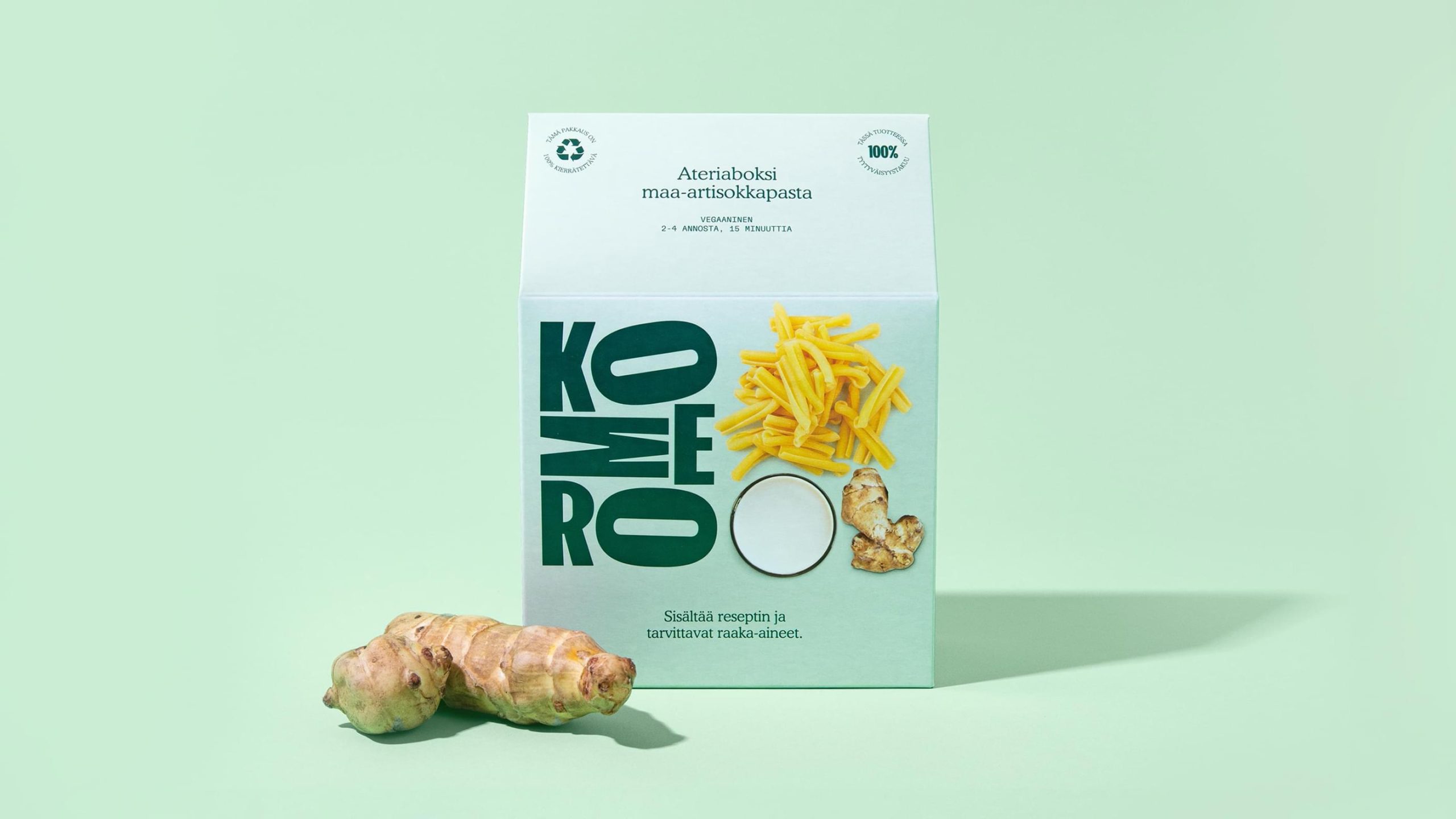
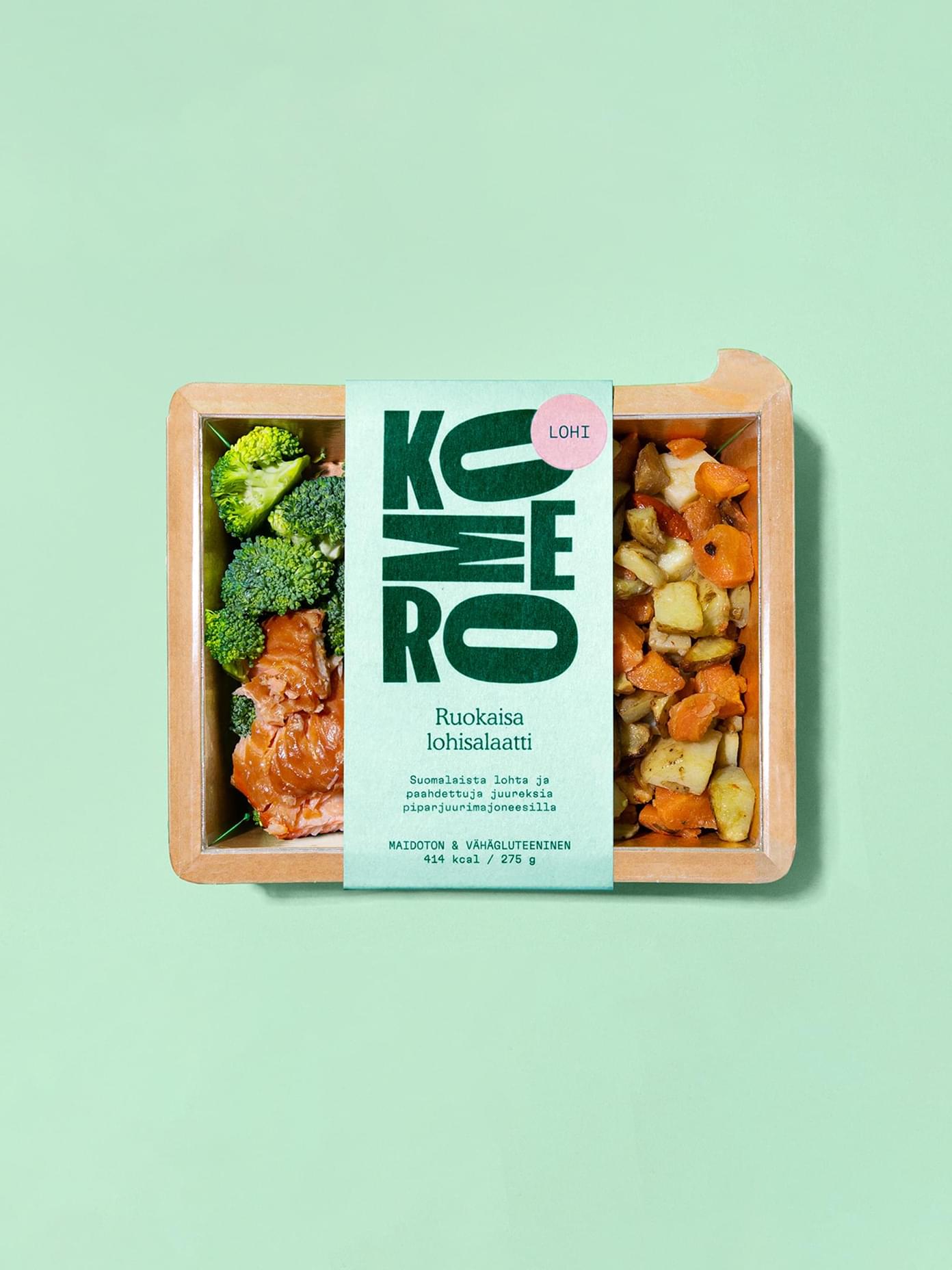
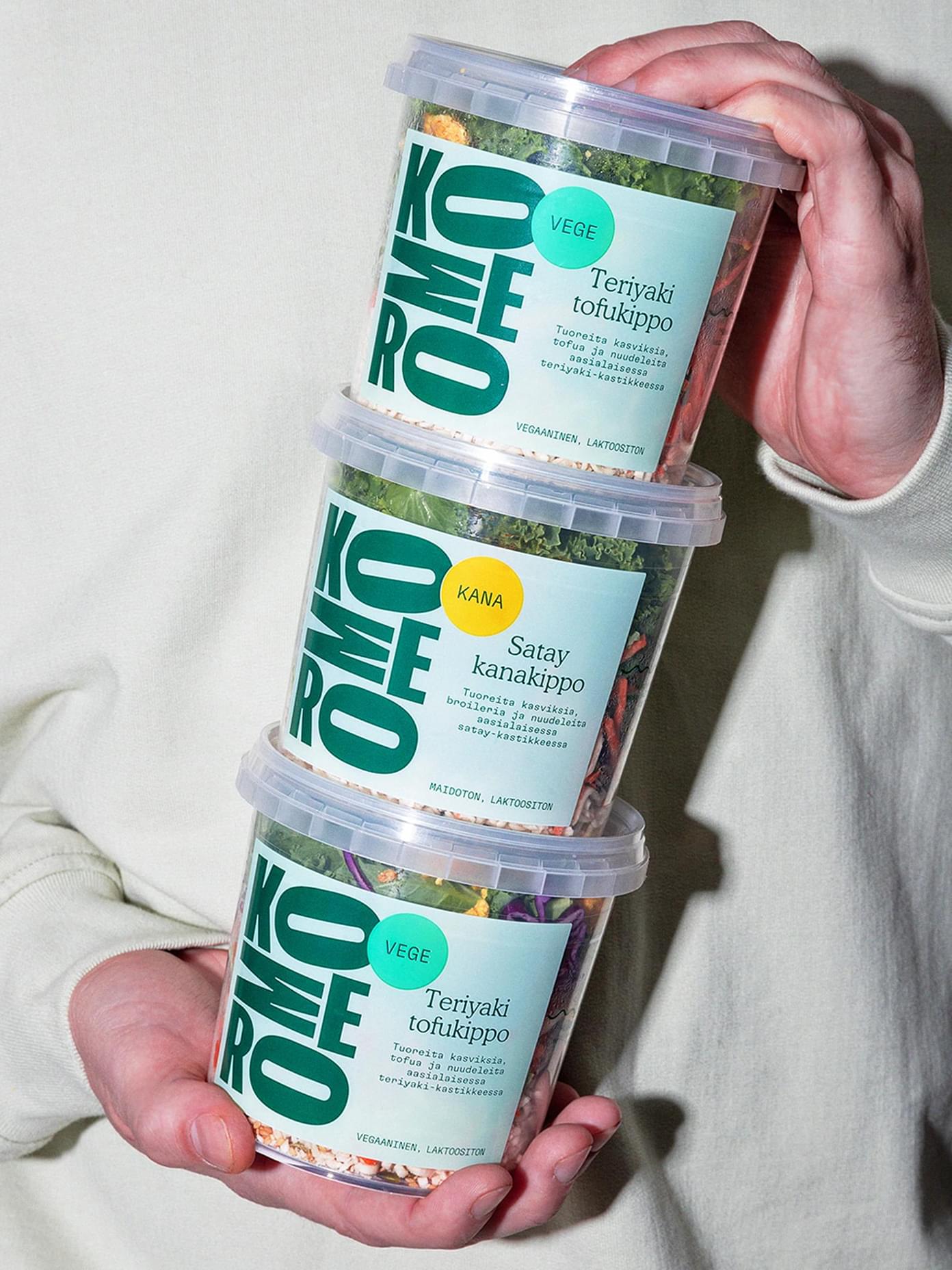
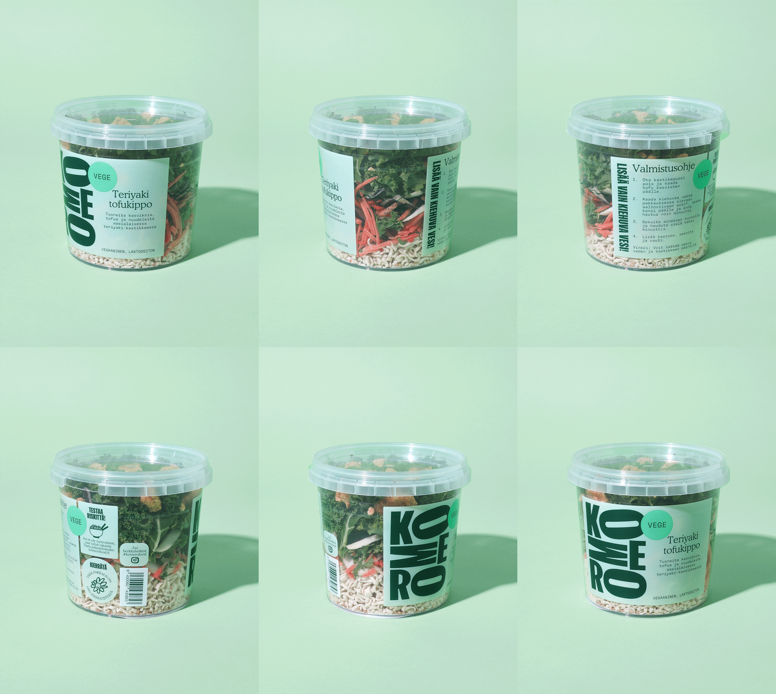
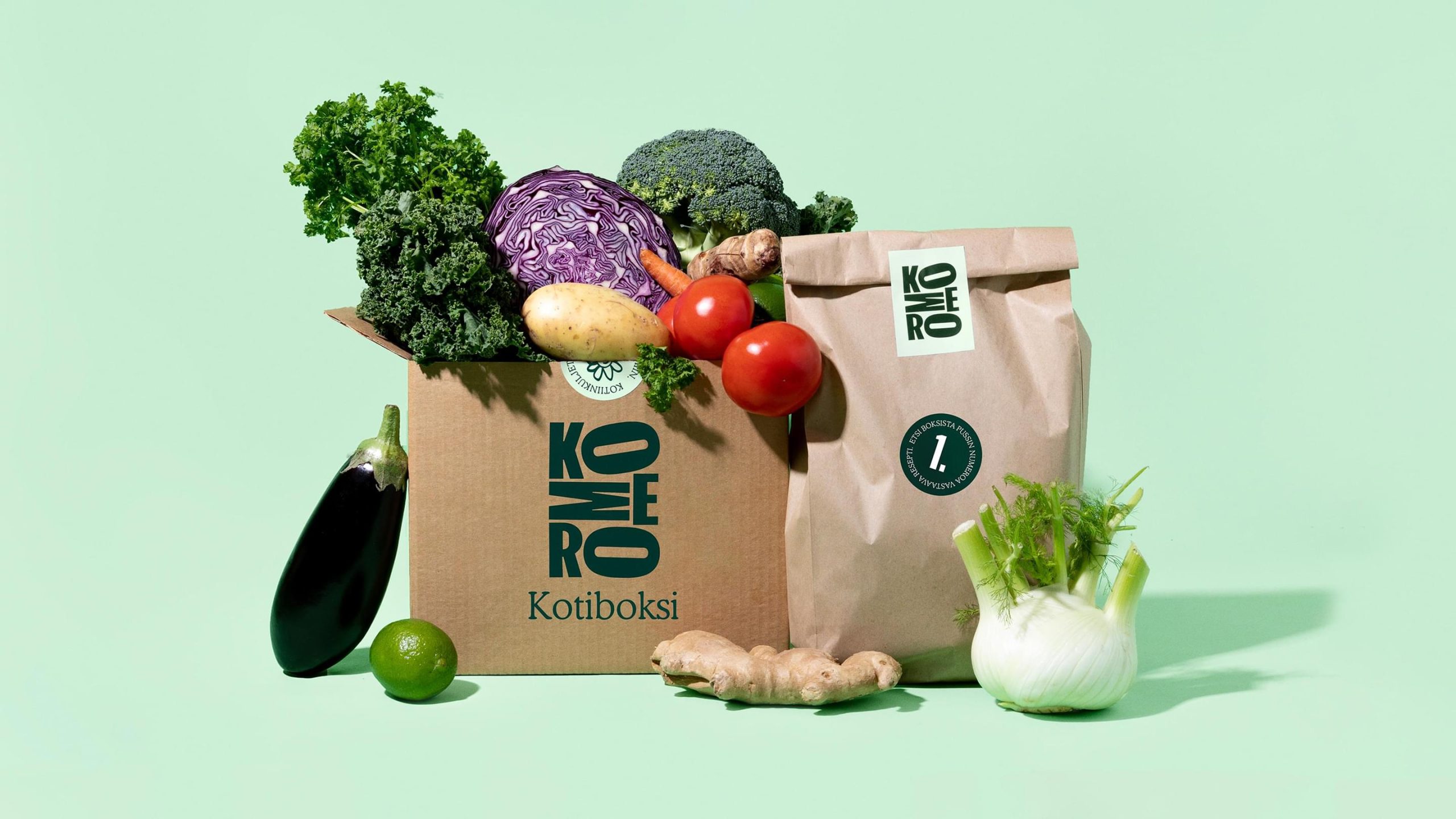
The jewel of the brand is the new logo, with its letters perfectly crammed into a “cupboard.” (That is komero in English.) It represents the frenzied love Komero has for food and innovation. The logo is big and bold — splashed across a diverse range of packages now available on your nearest supermarket shelves.
For us starving everyday achievers lost in the supermarkets — the days of desperation are over.
Impact: From desperation to distinction
Apart from the sparkly Gold award the Komero packaging won from the Finnish marketing establishment, Vuoden Huiput 2022, Komero continues its journey of invention — now with some snappy new brand tools at hand. Whatever new change-food comes out of the meal accelerator, it will join a beautiful, healthy family, free of heart conditions.
Awards
- Gold, Package Design – Vuoden Huiput 2022